Cycle tracking only delivers value when users remember to log their period.
How can we turn My Monthly into a proactive companion that shows up before users have to ask?
2026 PRODUCT DESIGN
iOS app
Mobile
Widgets
Overview
Company
My Monthly
Time
March - May 2026, Launched May 2nd
Team
1 Designer (Me), 1 Dev
Role
Product Designer
My Role
As a sole designer, I designed My Monthly's widget system to shift the product from a destination app into a proactive companion. Working within iOS constraints, I built a visual language for cycle phase and partner context that reads at a glance.
Solution
Shipped an iOS widget system that delivers glanceable cycle data and daily insights to drive daily engagement.
Outcomes
+38%
DAU growth during rollout period
+23%
MAU growth
+63%
Weekly returning users vs. 9 weeks before launch
The week of May 14 (2 weeks after launch) saw the largest single-week active-user jump in 18 months of data!
Key features
Feature 1
Logging without opening the app
Tapping the widget deep-links straight into the log flow and confirms in seconds.
Feature 2
Built for two people, not one
Every Countdown widget renders two ways: one view for the person tracking their cycle, one for the partner supporting them.

Feature 3
Mood check-ins that shift with your day
Mood companion widgets shift across morning, afternoon, and night to effectively nudge users.
Feature 4
From moods to body literacy
Mood logging is paired with phase-based color and copy. Each phase gets its own look and language. A daily check-in becomes a small lesson in body literacy.

Context
My Monthly is a period tracking app for couples. It grew organically for years, but it was time to rethink user engagement. Widgets became the key direction.

Problem
My Monthly only provided value when users remembered to open the app.
Meanwhile, competing habit and tracking apps stayed visible through Home Screen widgets. To close that gap, I explored three widget concepts.
1. The Countdown (Utility)
Clear, glanceable data like "Period in 3 days" or "Ovulation today."
2. The Insight (Education/Emotional)
High-value, low-logic-risk content like "Today you might feel more tired because..."
3. The Action (Retention)
Quick Log buttons (Log Mood, Log Flow) to make it as easy as possible for users to interact without opening the app.
Design process
Having just joined the team, I started with a thorough competitive analysis and ran early concept tests specifically to pin down design requirement.

Competitive Analysis
Researched across period trackers, habit streak apps, and tracking focused apps.

Concept Drafts
Shared early concept ideas with the design & marketing team.
Design iterations
Challenge 1.
Meaningful information, not overwhelming or underwhelming
Widgets have limited space, but the information shown still needs to feel complete enough to be useful.

Iterations focused on finding the right balance of text and visual elements within that constraint; enough to inform, not enough to clutter.
Challenge 2.
A design system that scales
Five widgets across two families, each needing to work for both primary and partner users, was a challenge in itself.

Using the existing color-coding system and characters, I built a scalable design system that extended consistently across all five, instead of solving each widget in isolation.
Challenge 3.
Iterations for clarity and one primary action

Challenge 4.
Thinking about growth strategy, not just a one-time launch
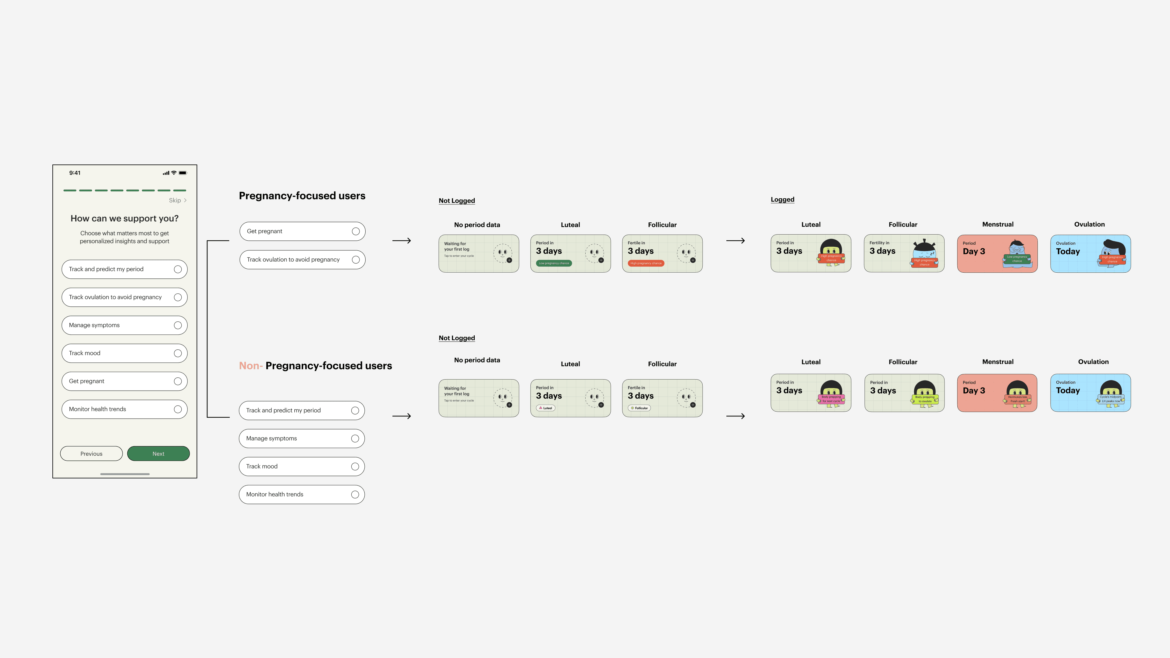
Targeted growth strategy
From our user research, we knew that not every user wants pregnancy-related data. Thus, showing the same phase framing to everyone risks real harm; positive or negative framing that lands wrong for someone in a different context.
We were already collecting onboarding answers about what each user wanted, but not applying that data anywhere in the design system.
This change must be structural change. I pushed for a structural change: segmenting widget content by onboarding intent, so pregnancy-focused and non-pregnancy-focused users each get insights that are actually meaningful to them.
Impact
+38%
DAU growth during rollout period
+23%
MAU growth
+63%
Weekly returning users vs. 9 weeks before launch
The week of May 14 (2 weeks after launch) saw the largest single-week active-user jump in 18 months of data!
Social media post on Instagram
Reflections
Trust matters as much as craft
Throughout this project, I worked closely with our branding team, developers, and marketing team. It taught me that shipping successfully depends on building real trust across the whole process.
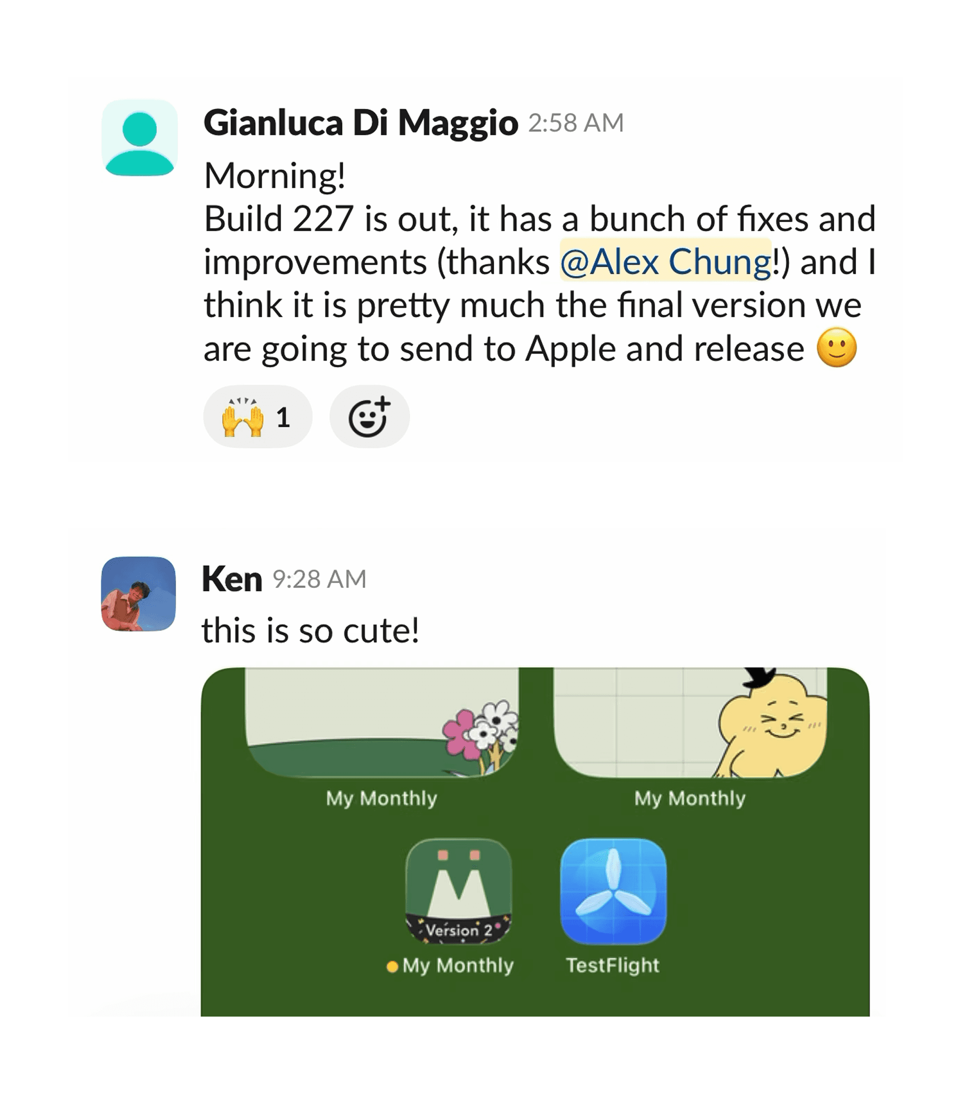
Slack shoutouts!!
.. and yes!! I enjoyed the entire process
I really loved owning this project end-to-end. That kind of full-process ownership was where I learned and enjoyed the most.

and endless hours of iterations🔨🔨