What if AI agents pick our travel destinations?
Bubbly AI is an AI concept design project, focusing on quick design iterations on swift UI, creating a fun and delightful engagement with AI agent based decision making.
2025 PRODUCT DESIGN
AI Concept
UI design
IOS
Overview
CLIENT
Self
Time
2025
Team
1 Dev, 1 Designer (Me)
Role
Product Designer
Tools
Swift. Figma
My Role
Solution
An AI that allows multi-persona decision making


Key Features
Feature 1
Create your proxy with bubbles
Make trip planning fun. Set preferences and weights through playful bubbles and build your AI trip proxy.
It took a lot of iterations to get the physics right, but I'm so happy with how it turned out!
Feature 2
Talk to fine-tune your trip taste
Interact with AI to adjust preference weights or receive recommended tags.
Feature 3
Put your cards on the table ♣️
AI will express your preferences for you, making it easier for the group to decide together.
Feature 4
Deal maker!
No drama, no oversharing. Bubbly will curate options based on each proxy's unique preferences analyses.
Context
Everyone is talking about AI but I found it hard to dive deeper into "UI" part for AI products.
Using the latest iOS 26 glass interfaces, I explored creating delightful interactions with "bubbles".
Problem
We have AI agents. Why not make them help group decision-making?
Current AIs are built for individuals, not groups
Group decisions are messy and difficult
Competitive Analysis
I tested a scenario of group trip planning with existing apps like Airbnb Tripadvisor, and Hotels.com.
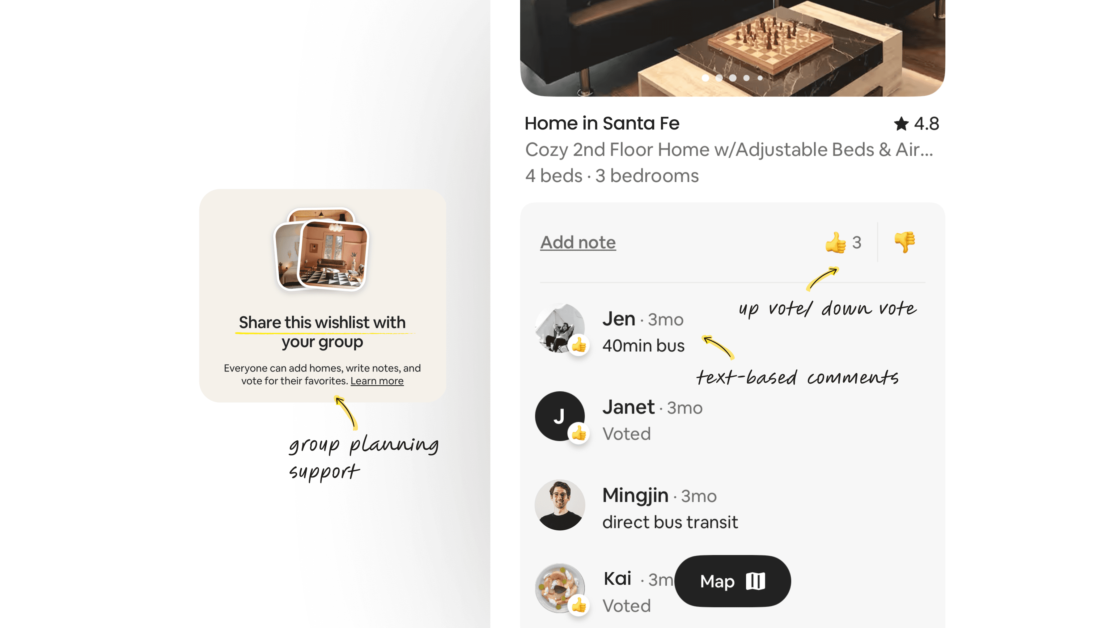

Tripadvisor
Tripadvisor also had a group wishlist, but lacked additional features to share opinions beyond text-based comments.
Initial brainstorming
Through competitive analysis, I discovered design opportunities.
No AI feature for groups
Even when AI was used, it was 1 person recommendation system and it didn't work in group decision-making.
AI for a group, not just a solo
Recommender system that can interpret & reconcile inputs from multiple users, generating group recs.
No group-aware settings
None of the platforms allows let users collaboratively set filters/ preferences. There’s no way to balance or weigh.
Enable dynamic preferences
The new design should allow users to set filters collaboratively, and adjust individual priorities and preferences.
No group-aware settings
Airbnb has up/down voting, and TripAdvisor has comments. But neither helps shared decision formation,
No more manual work
With a criteria-based recommender, we can reduce the burden of manual negotiations
Concept
Bubble-inspired, playful trip planning!
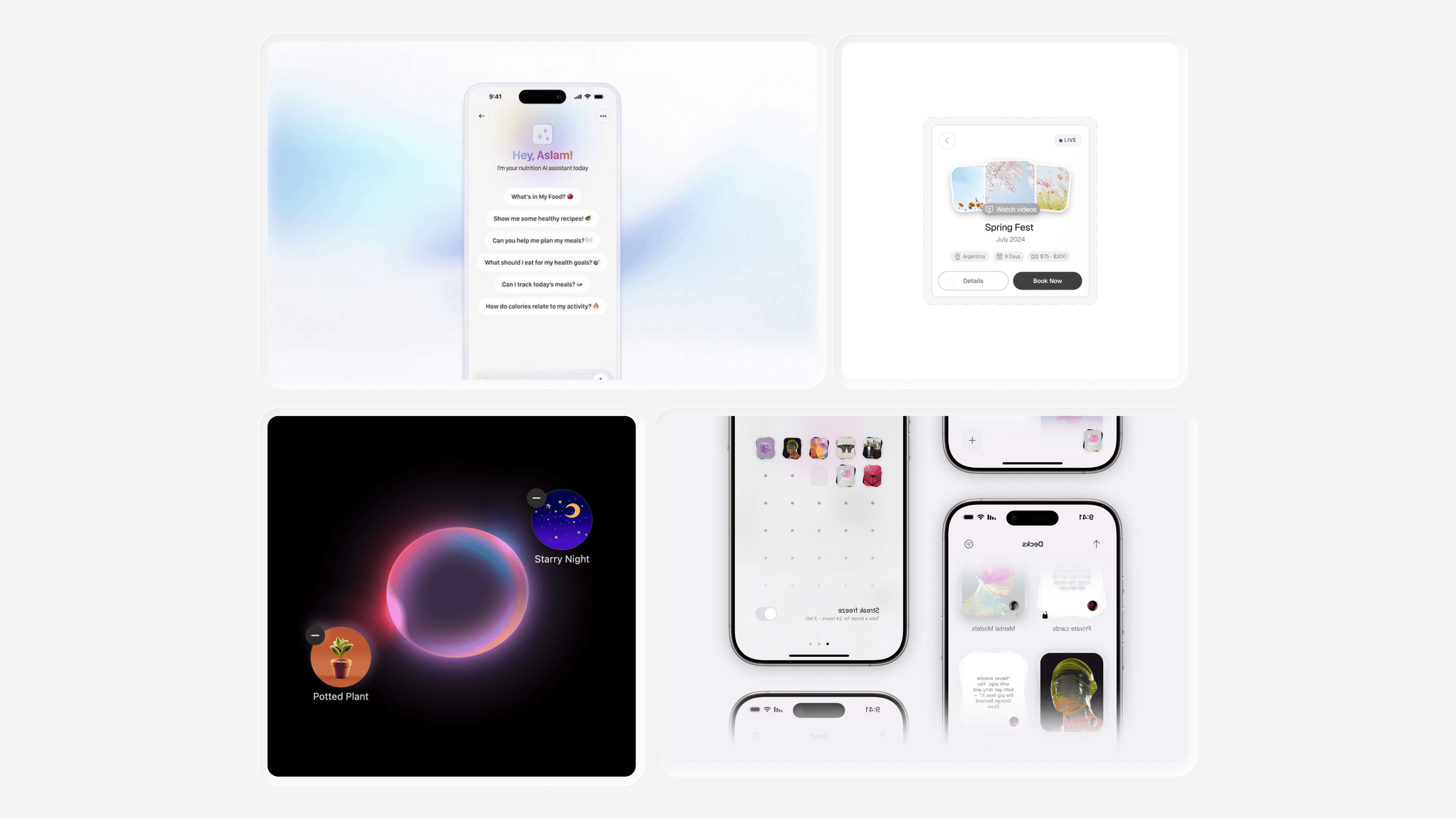
Inspired by Apple’s Image Playground, I created a moodboard for an interaction that combines a glass-like aesthetic with flexible, dynamic behavior.
Wireframes
Considering components, and the overall design system, I quickly sketched the main flows.

Flow 1
Editing preferences
Edit preference for my proxy

Flow 2
Group-AI curation
Adjust weight of each preferences
Share my proxy with friends

Flow 3
Voice and image-based AI UX
Chat with AI to adjust preference weight or receive recommended tags.
Upload images to get more personalized or related keywords (bubbles).
Design iterations
Detail 1
Intentional craft to reinforce the AI experience

Gradient UI
Liquid glass aesthetic
Detail 2
Small tweaks to engage users

Bringing the card game metaphor into the UI
Detail 3
Crafting playful moments
Turning tedious profile setup into play
Real-time physics for the bubbles
Reflections
Ideas to implementation
This was my first time working on a UI-heavy project directly with a developer. I learned how to clearly translate UI and interaction needs into developer-friendly terms while iterating through constant collaboration.
Explore, learn, enjoy
At first, I felt pressured to build an AI concept by strictly following UI “must-dos.” But I soon realized it was restricting my creativity and approached it as a creative experiment. This mindset gave me the freedom to explore more.