Client Project
Client Project
Client Project
Mobile App
Mobile App
Mobile App
Design System
Design System
Design System
Research Based Design
Research Based Design
Research Based Design
An all-in-one app for Opioid users to navigate a complex support system
An all-in-one app for Opioid users to navigate a complex support system
An all-in-one app for Opioid users to navigate a complex support system
Collaborating with a doctor, we designed a solution Weave to help opioid drug users navigate the complex harm reduction system in a simpler, more intuitive way.
Collaborating with a doctor, we designed a solution Weave to help opioid drug users navigate the complex harm reduction system in a simpler, more intuitive way.
Collaborating with a doctor, we designed a solution Weave to help opioid drug users navigate the complex harm reduction system in a simpler, more intuitive way.
Timeline
Spring 2024 (6 weeks)
client
University of Pittsburgh Medical Center (Dr. Paul J. Joudrey)
My Role
1-End to end design process 2-Led the branding, including slogan, storytelling, and animations 3-Synthesized research findings
Timeline
Spring 2024 (6 weeks)
client
University of Pittsburgh Medical Center (Dr. Paul J. Joudrey)
My Role
1-End to end design process 2-Led the branding, including slogan, storytelling, and animations 3-Synthesized research findings
Timeline
Spring 2024 (6 weeks)
client
University of Pittsburgh Medical Center (Dr. Paul J. Joudrey)
My Role
1-End to end design process 2-Led the branding, including slogan, storytelling, and animations 3-Synthesized research findings
Timeline
Spring 2024 (6 weeks)
client
University of Pittsburgh Medical Center (Dr. Paul J. Joudrey)
My Role
1-End to end design process 2-Led the branding, including slogan, storytelling, and animations 3-Synthesized research findings
Timeline
Spring 2024 (6 weeks)
client
University of Pittsburgh Medical Center (Dr. Paul J. Joudrey)
My Role
1-End to end design process 2-Led the branding, including slogan, storytelling, and animations 3-Synthesized research findings
Overview
Background
220 people in the U.S. died each day from an opioid overdose in 2021. In this crisis, Pittsburgh was not an exception.
Collaborating with Dr. Joudrey, we created a mobile app that helps individuals dealing with opioid addiction locate nearest services they need.

Mission
1
Create a mobile tool to help individuals dealing with opioid addiction locate and navigate local treatment centers.
Mission
1
Create a mobile tool to help individuals dealing with opioid addiction locate and navigate local treatment centers.
Mission
1
Create a mobile tool to help individuals dealing with opioid addiction locate and navigate local treatment centers.
Mission
1
Create a mobile tool to help individuals dealing with opioid addiction locate and navigate local treatment centers.
Mission
1
Create a mobile tool to help individuals dealing with opioid addiction locate and navigate local treatment centers.
Iteration Process
We went through several design iterations based on client reviews and user tests, ensuring the feasibility and validity of our final outcome.
Week 1
Client
Review
Initial wireframe
Week 3-4
User Tests
& Interviews
Usability testing
Week 5
In-class
feedback
Feedback on
user test results
Week 6
Final
Presentation
Final delivery to
client & stakeholders
Week 1
Client
Review
Initial wireframe
Week 3-4
User Tests
& Interviews
Usability testing
Week 5
In-class
feedback
Feedback on
user test results
Week 6
Final
Presentation
Final delivery to
client & stakeholders
Week 1
Client
Review
Initial wireframe
Week 3-4
User Tests
& Interviews
Usability testing
Week 5
In-class
feedback
Feedback on
user test results
Week 6
Final
Presentation
Final delivery to
client & stakeholders
Week 1
Client
Review
Initial wireframe
Week 3-4
User Tests
& Interviews
Usability testing
Week 5
In-class
feedback
Feedback on
user test results
Week 6
Final
Presentation
Final delivery to
client & stakeholders
Week 1
Client
Review
Initial wireframe
Week 3-4
User Tests
& Interviews
Usability testing
Week 5
In-class
feedback
Feedback on
user test results
Week 6
Final
Presentation
Final delivery to
client & stakeholders
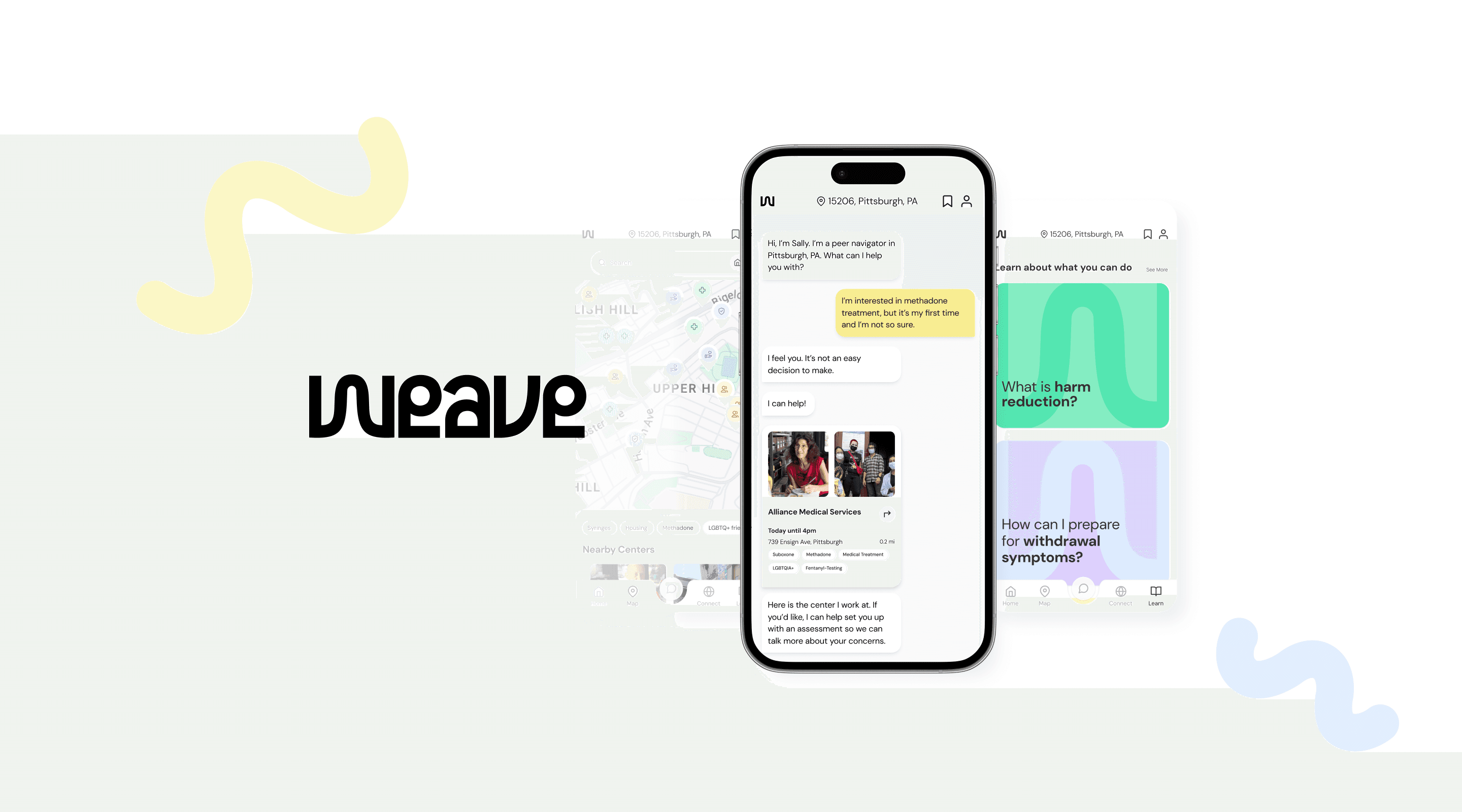
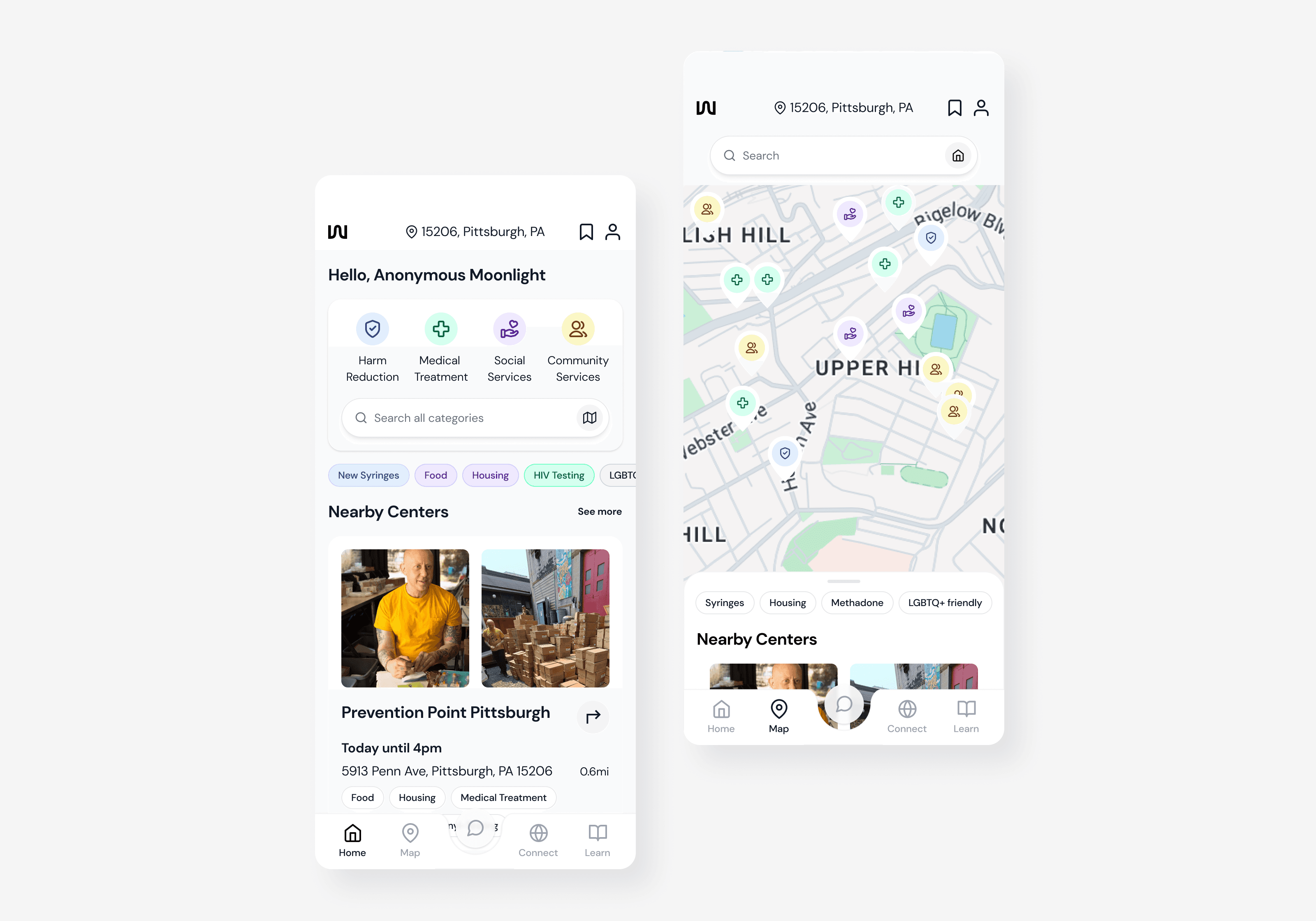
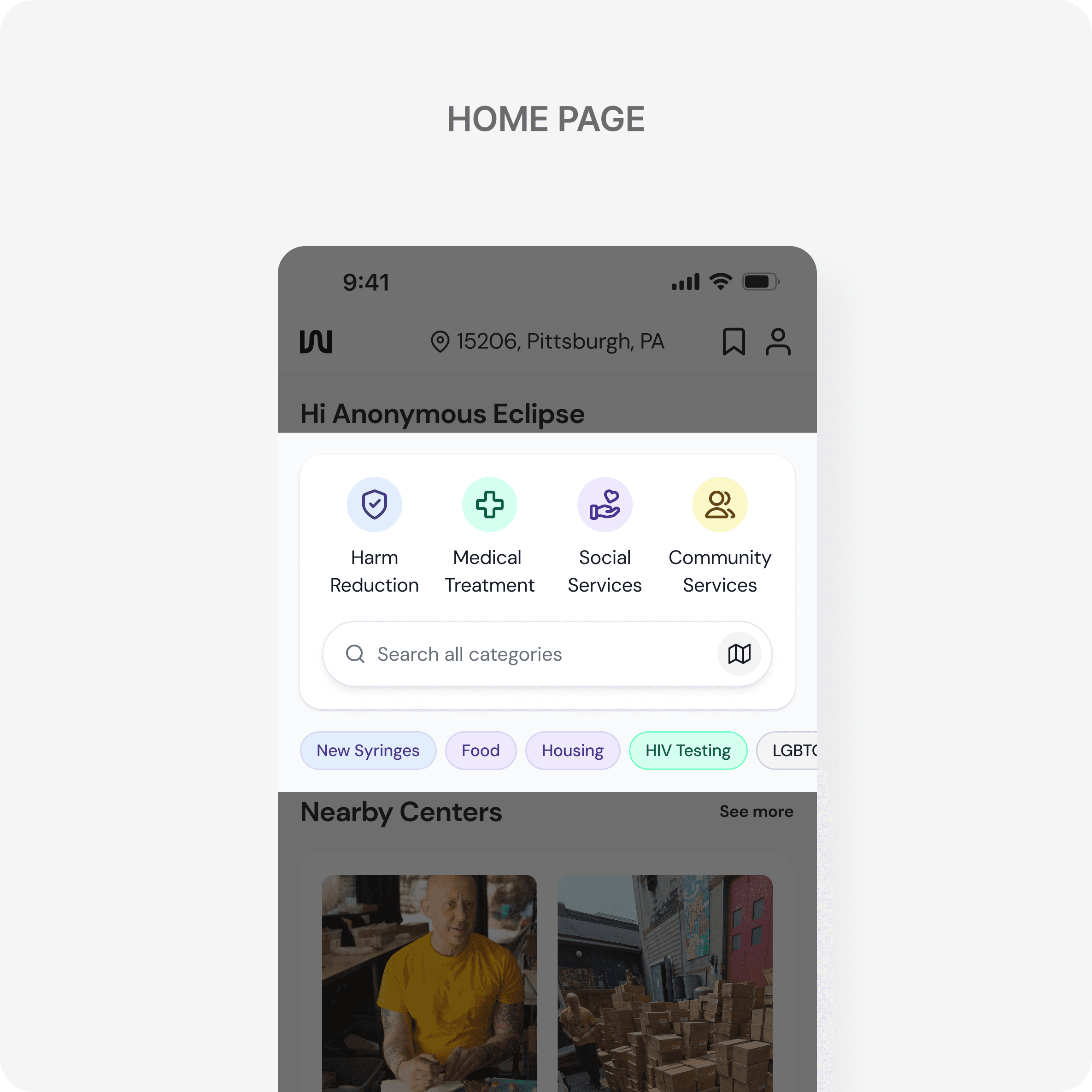
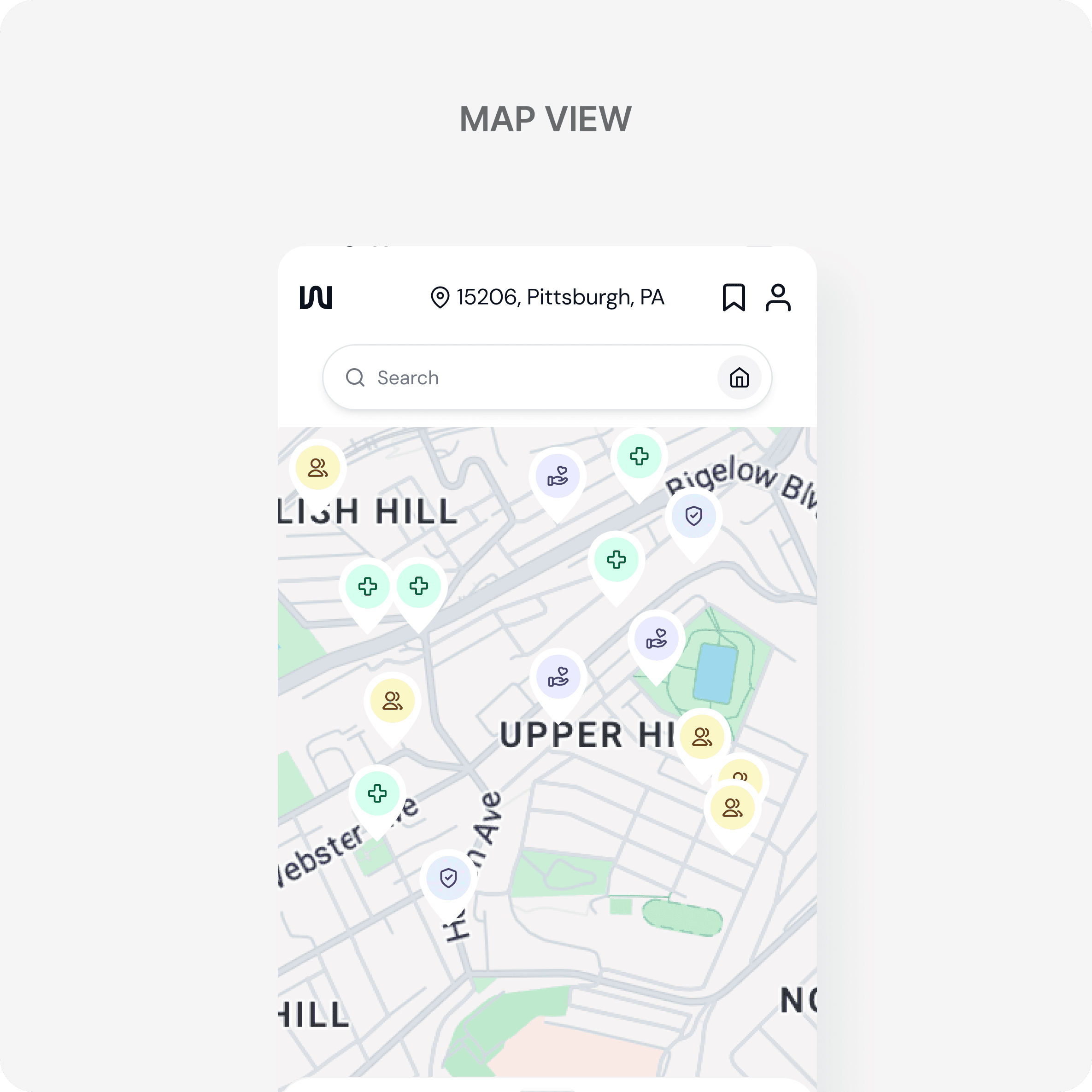
solution
We Weave, We Live!
Weave is a mobile app that connects people who need harm reduction services (HRS) with local service centers with the transparent, easy access, and judgement-free information.
solution
We Weave, We Live!
Weave is a mobile app that connects people who need harm reduction services (HRS) with local service centers with the transparent, easy access, and judgement-free information.
solution
We Weave, We Live!
Weave is a mobile app that connects people who need harm reduction services (HRS) with local service centers with the transparent, easy access, and judgement-free information.
solution
We Weave, We Live!
Weave is a mobile app that connects people who need harm reduction services (HRS) with local service centers with the transparent, easy access, and judgement-free information.
solution
We Weave, We Live!
Weave is a mobile app that connects people who need harm reduction services (HRS) with local service centers with the transparent, easy access, and judgement-free information.
01/ Main Features
01/ Main Features
01/ Main Features
01/ Main Features
01/ Main Features
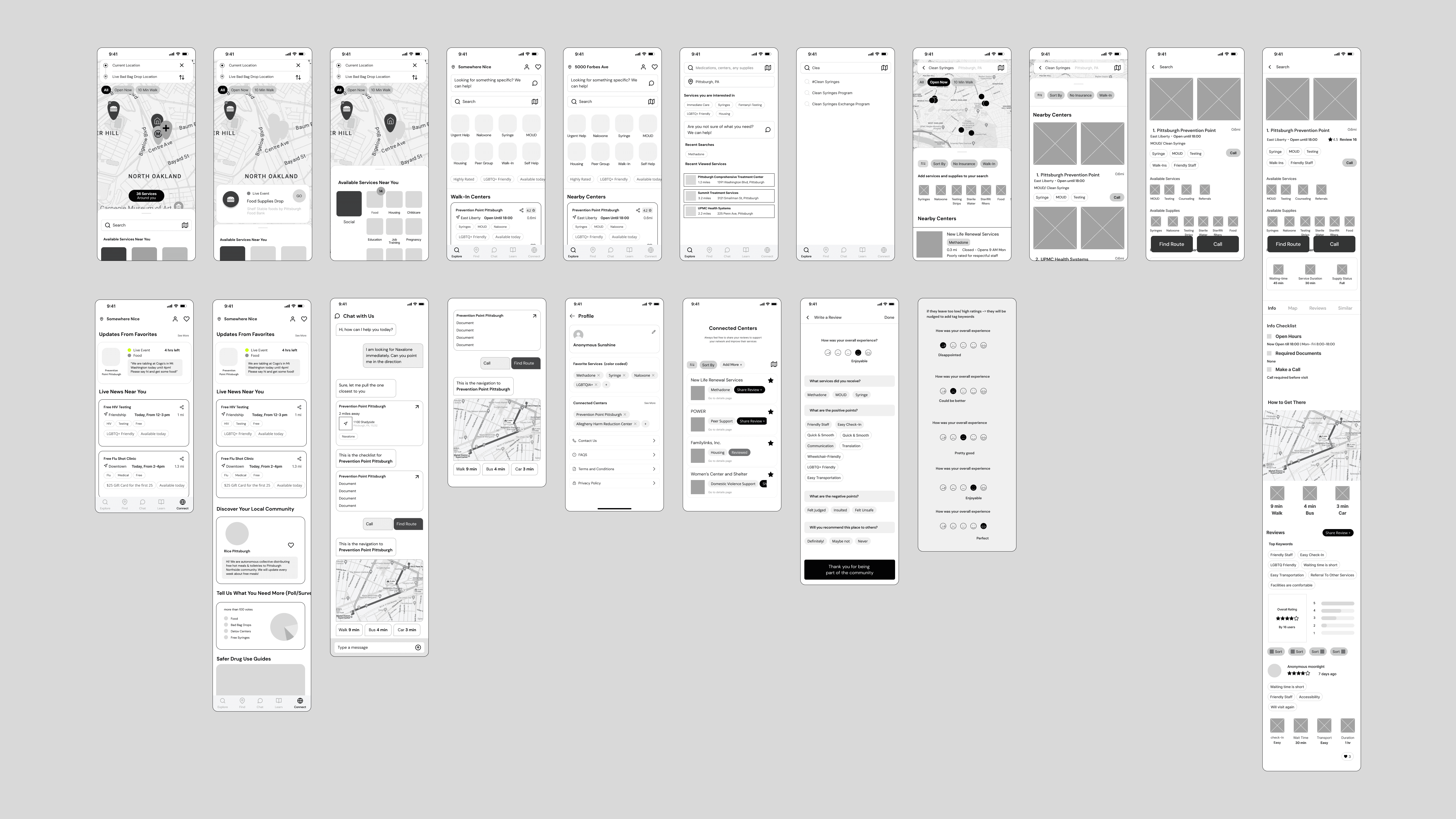
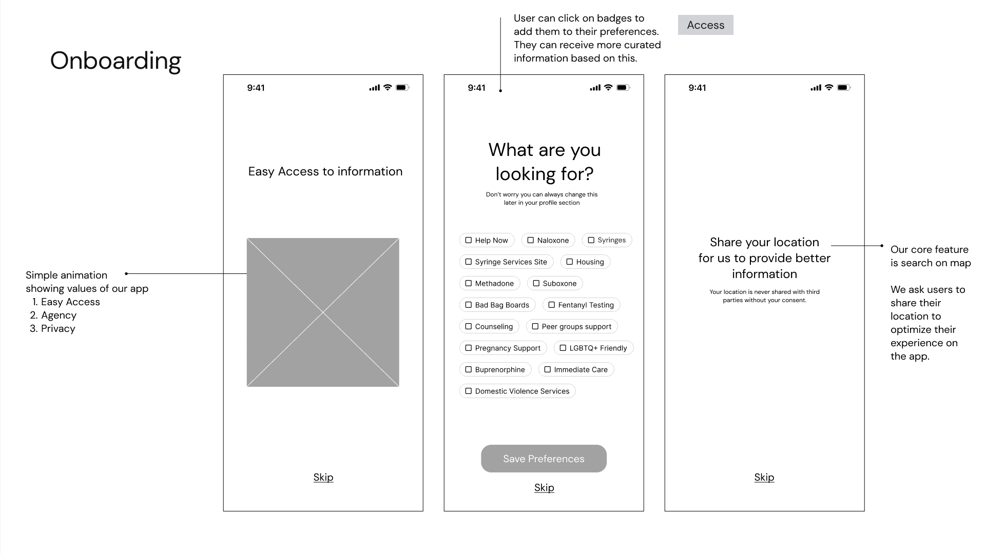
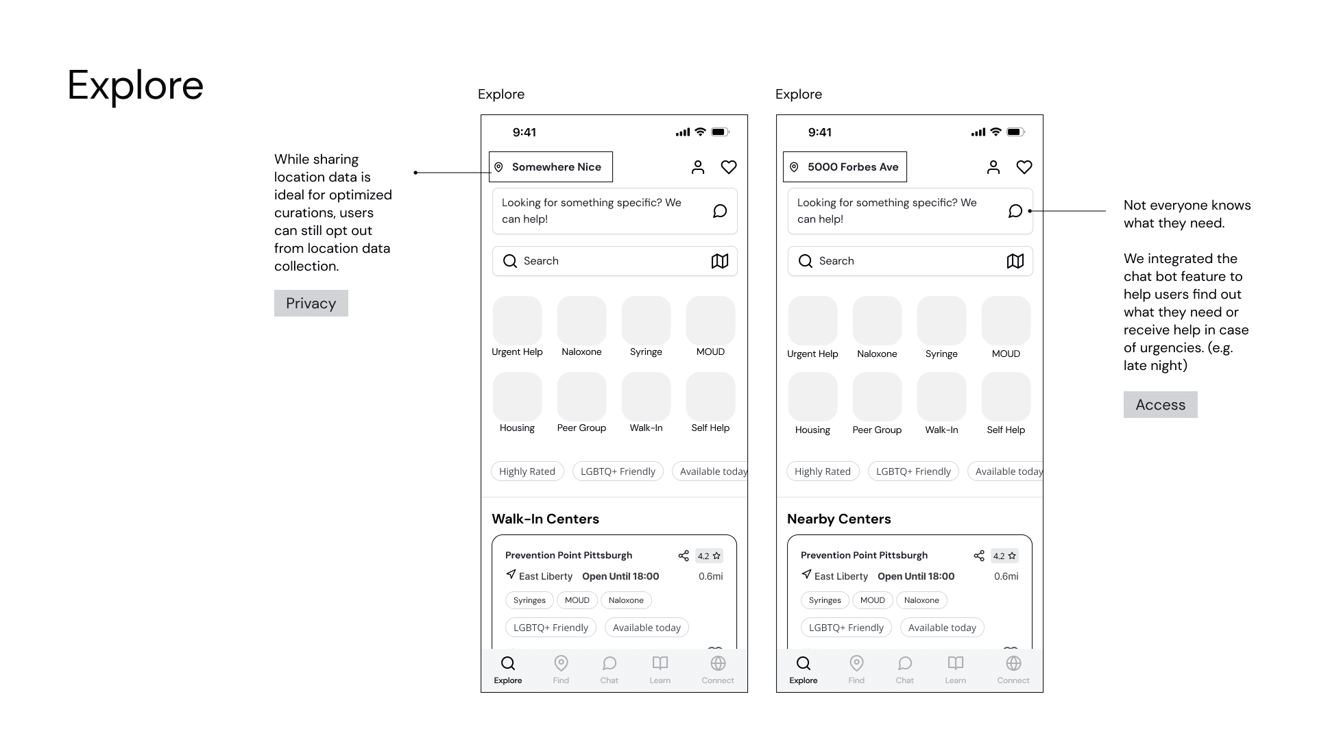
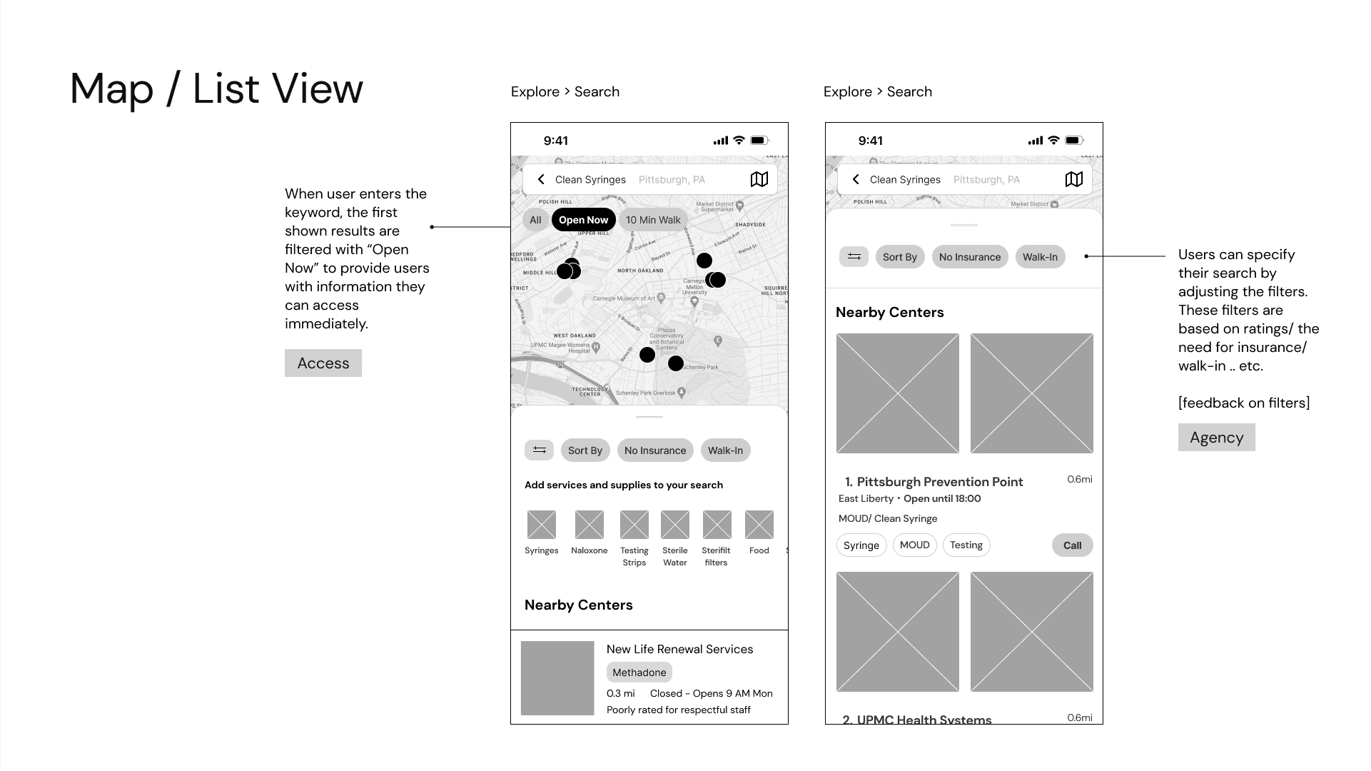
FEATURE 1-search
Find what you need in just a few clicks
On Weave, users can easily navigate a complex system with intuitive category and location-based search.
FEATURE 1-search
Find what you need in just a few clicks
On Weave, users can easily navigate a complex system with intuitive category and location-based search.
FEATURE 1-search
Find what you need in just a few clicks
On Weave, users can easily navigate a complex system with intuitive category and location-based search.
FEATURE 1-search
Find what you need in just a few clicks
On Weave, users can easily navigate a complex system with intuitive category and location-based search.
FEATURE 1-search
Find what you need in just a few clicks
On Weave, users can easily navigate a complex system with intuitive category and location-based search.
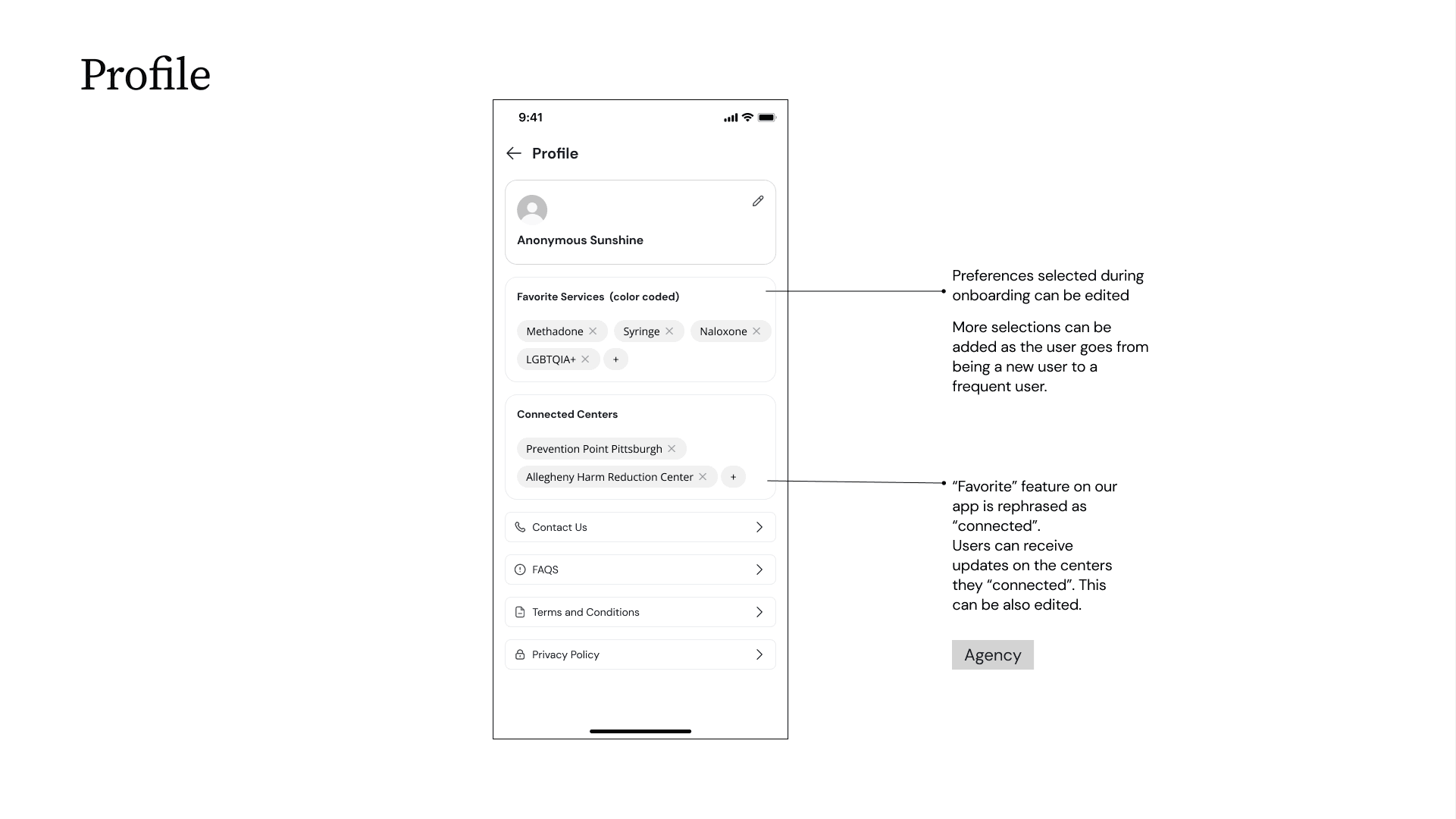
FEATURE 2-detailed information
Bite-sized, easy-to-digest information
Based on our research with opioid addiction survivors, Weave provides visualized information that reduces cognitive load and supports easier decision-making.
FEATURE 2-detailed information
Bite-sized, easy-to-digest information
Based on our research with opioid addiction survivors, Weave provides visualized information that reduces cognitive load and supports easier decision-making.
FEATURE 2-detailed information
Bite-sized, easy-to-digest information
Based on our research with opioid addiction survivors, Weave provides visualized information that reduces cognitive load and supports easier decision-making.
FEATURE 2-detailed information
Bite-sized, easy-to-digest information
Based on our research with opioid addiction survivors, Weave provides visualized information that reduces cognitive load and supports easier decision-making.
FEATURE 2-detailed information
Bite-sized, easy-to-digest information
Based on our research with opioid addiction survivors, Weave provides visualized information that reduces cognitive load and supports easier decision-making.

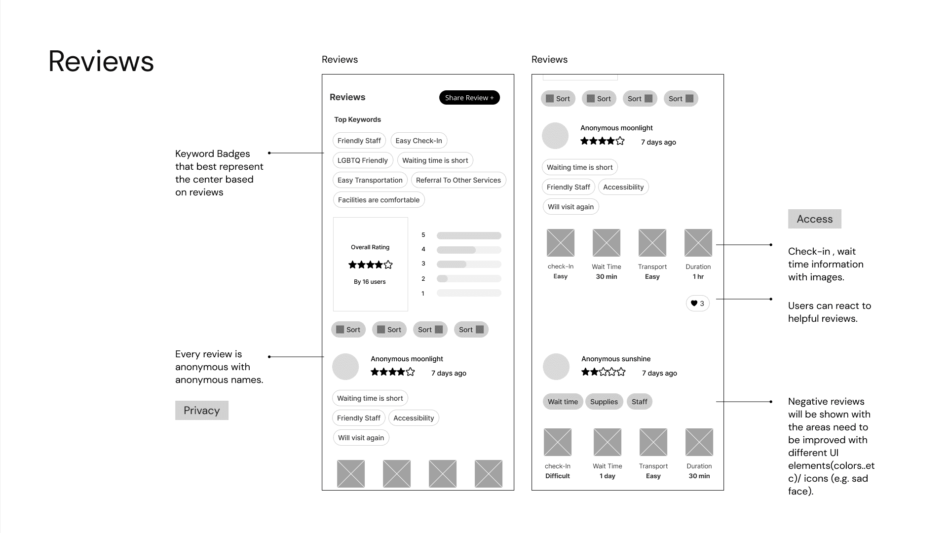
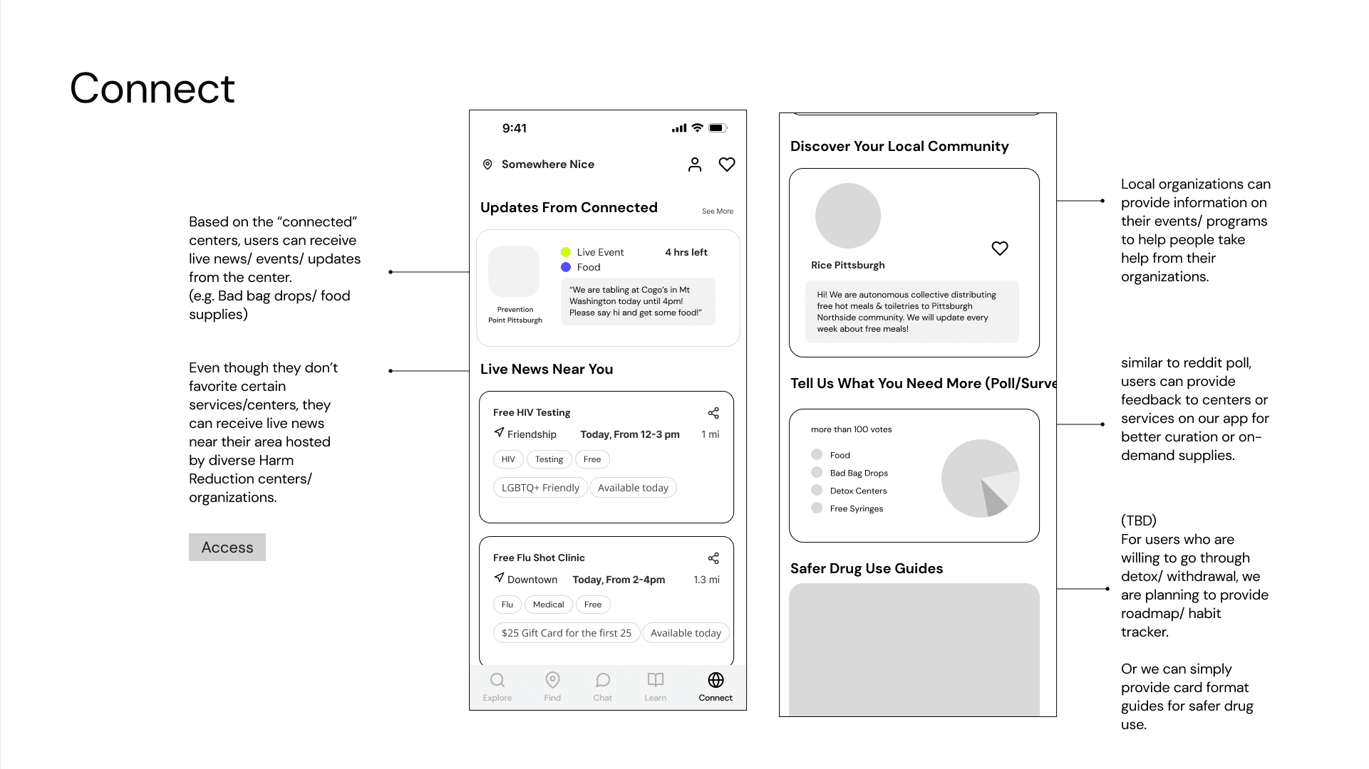
FEATURE 3-anonymous review
Real voices, powered by Weave community
Opioid users tend to rely on word-of-mouth information due to the privacy-sensitive nature of drug use. Weave provides a safe space for them to share their unique experiences and contribute to the community.
FEATURE 3-anonymous review
Real voices, powered by Weave community
Opioid users tend to rely on word-of-mouth information due to the privacy-sensitive nature of drug use. Weave provides a safe space for them to share their unique experiences and contribute to the community.
FEATURE 3-anonymous review
Real voices, powered by Weave community
Opioid users tend to rely on word-of-mouth information due to the privacy-sensitive nature of drug use. Weave provides a safe space for them to share their unique experiences and contribute to the community.
FEATURE 3-anonymous review
Real voices, powered by Weave community
Opioid users tend to rely on word-of-mouth information due to the privacy-sensitive nature of drug use. Weave provides a safe space for them to share their unique experiences and contribute to the community.
FEATURE 3-anonymous review
Real voices, powered by Weave community
Opioid users tend to rely on word-of-mouth information due to the privacy-sensitive nature of drug use. Weave provides a safe space for them to share their unique experiences and contribute to the community.

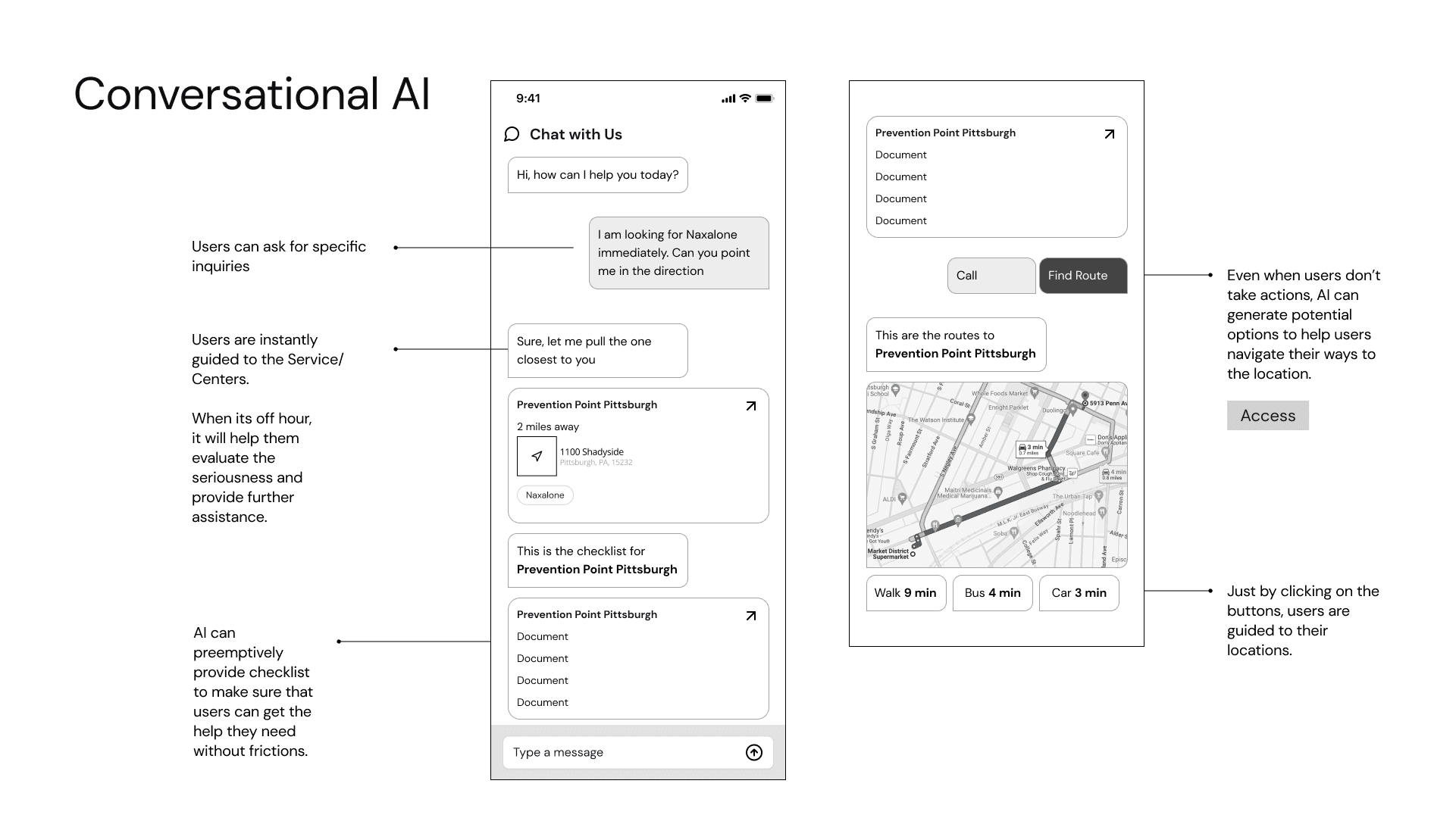
FEATURE 4-LIVE CHAT
Be seen, be heard, get real support
Even with sufficient information, opioid users often find it difficult to make decisions on their own. Weave helps them connect with those who can provide local and case-specific help.
FEATURE 4-LIVE CHAT
Be seen, be heard, get real support
Even with sufficient information, opioid users often find it difficult to make decisions on their own. Weave helps them connect with those who can provide local and case-specific help.
FEATURE 4-LIVE CHAT
Be seen, be heard, get real support
Even with sufficient information, opioid users often find it difficult to make decisions on their own. Weave helps them connect with those who can provide local and case-specific help.
FEATURE 4-LIVE CHAT
Be seen, be heard, get real support
Even with sufficient information, opioid users often find it difficult to make decisions on their own. Weave helps them connect with those who can provide local and case-specific help.
FEATURE 4-LIVE CHAT
Be seen, be heard, get real support
Even with sufficient information, opioid users often find it difficult to make decisions on their own. Weave helps them connect with those who can provide local and case-specific help.

02/ Problem Space
Context setting
Disclaimer: This project is about drug use
Given its sensitive nature, extensive preliminary research was essential before we began. Below are the key concepts we clarified before starting the main task.
Context setting
Disclaimer: This project is about drug use
Given its sensitive nature, extensive preliminary research was essential before we began. Below are the key concepts we clarified before starting the main task.
Context setting
Disclaimer: This project is about drug use
Given its sensitive nature, extensive preliminary research was essential before we began. Below are the key concepts we clarified before starting the main task.
Context setting
Disclaimer: This project is about drug use
Given its sensitive nature, extensive preliminary research was essential before we began. Below are the key concepts we clarified before starting the main task.
Context setting
Disclaimer: This project is about drug use
Given its sensitive nature, extensive preliminary research was essential before we began. Below are the key concepts we clarified before starting the main task.
Opioids
are a class of drugs that include heroin and fentanyl. Although very useful to treat pain, they can cause physical dependency and addiction.
Harm Reduction
service(HRS) aims to reduce the negative impacts of drug use. It focuses on keeping people alive rather than cessation.
Peer Navigators
are people with lived experience on drugs. They work at harm reduction services guiding people who use drugs to find the help they need.
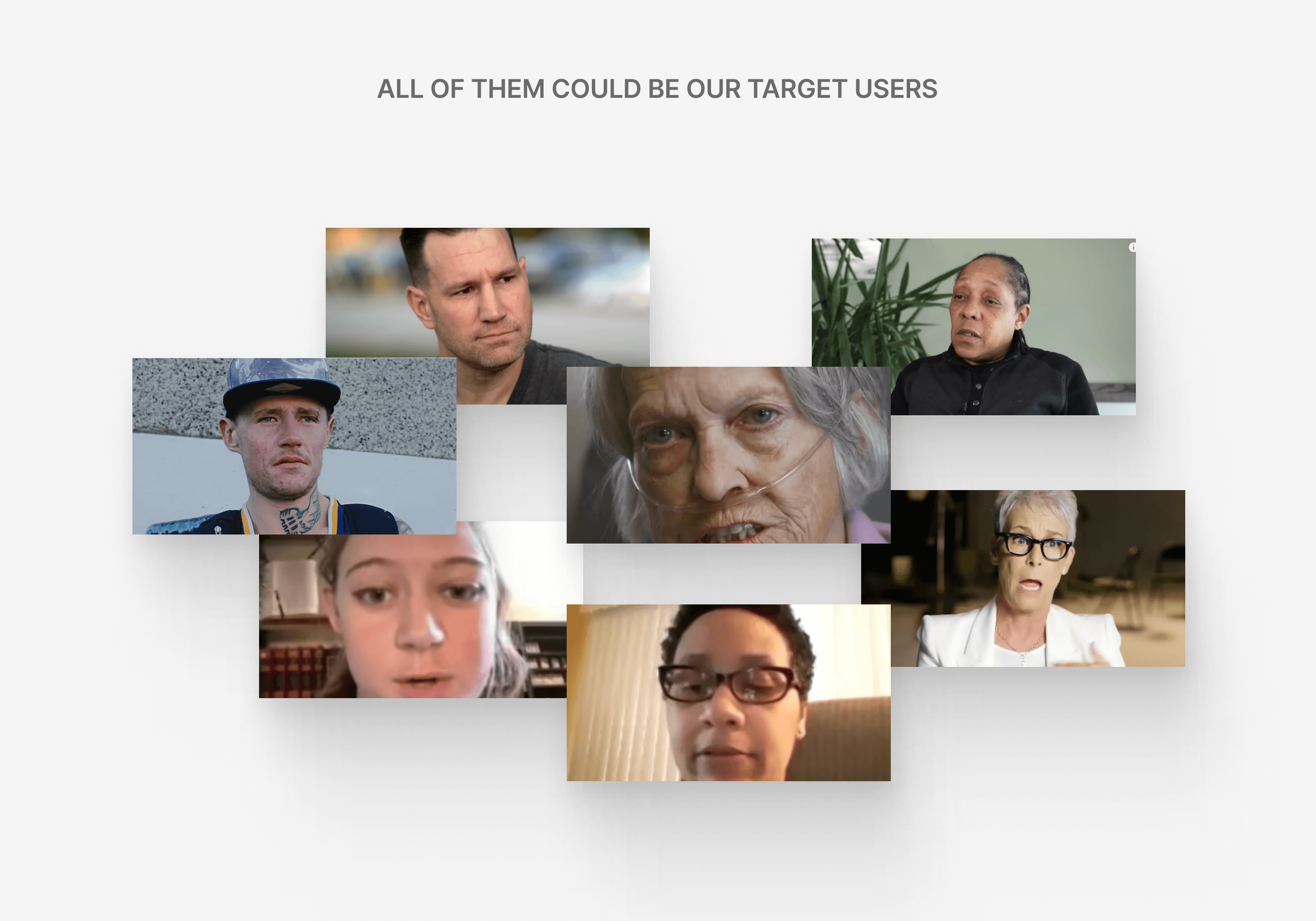
Our targets
include drug users, their supportive family and friends, peer navigators, and larger communities aiming to share information more effectively.
painpoints investigation
What's not working with the current system?
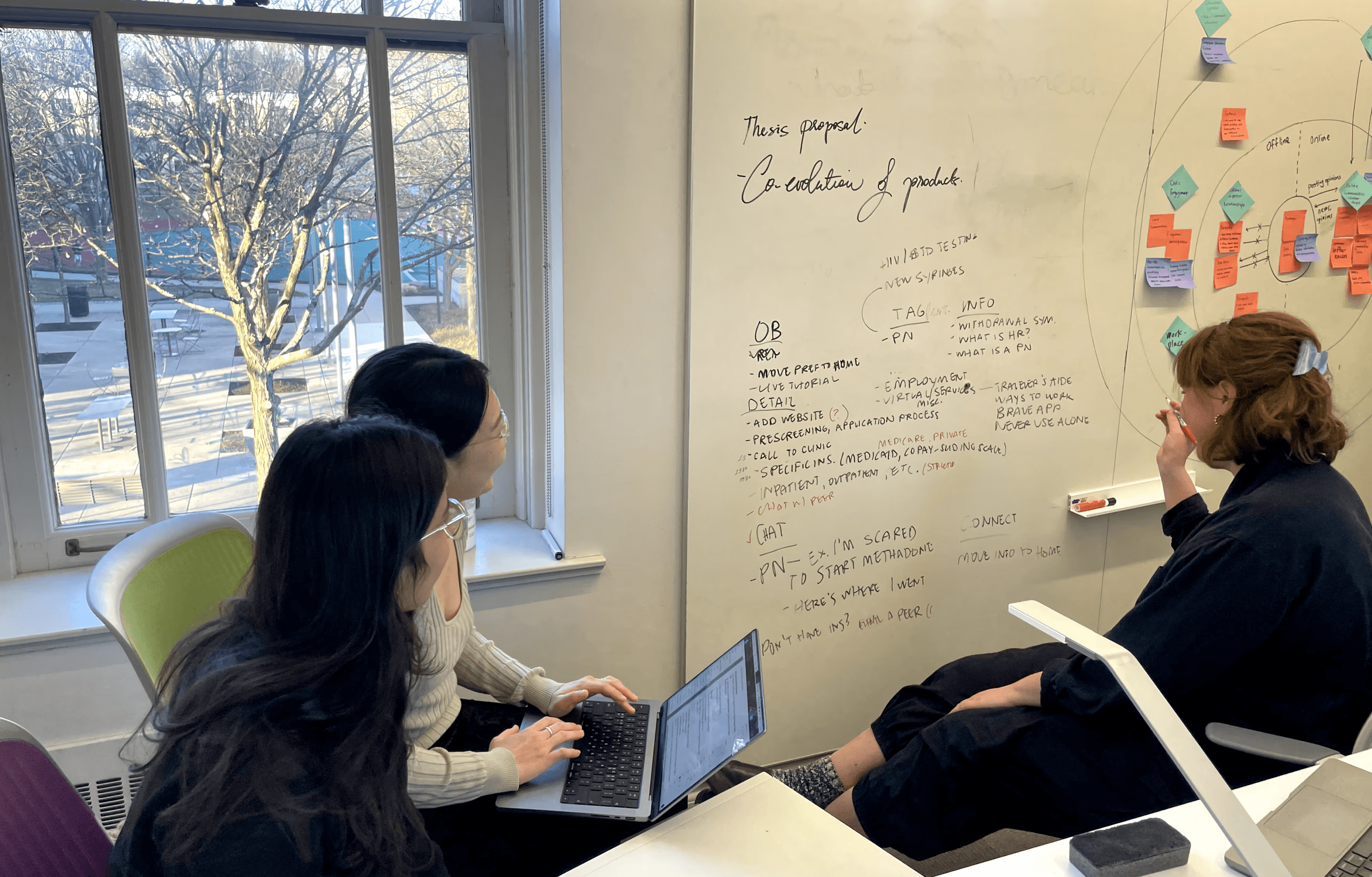
Faced with the difficulty of directly meeting people who use drugs, we took a unique approach by collecting insights from papers that included interviews. Through affinity diagramming, we identified three key insights:
painpoints investigation
What's not working with the current system?
Faced with the difficulty of directly meeting people who use drugs, we took a unique approach by collecting insights from papers that included interviews. Through affinity diagramming, we identified three key insights:
painpoints investigation
What's not working with the current system?
Faced with the difficulty of directly meeting people who use drugs, we took a unique approach by collecting insights from papers that included interviews. Through affinity diagramming, we identified three key insights:
painpoints investigation
What's not working with the current system?
Faced with the difficulty of directly meeting people who use drugs, we took a unique approach by collecting insights from papers that included interviews. Through affinity diagramming, we identified three key insights:
painpoints investigation
What's not working with the current system?
Faced with the difficulty of directly meeting people who use drugs, we took a unique approach by collecting insights from papers that included interviews. Through affinity diagramming, we identified three key insights:
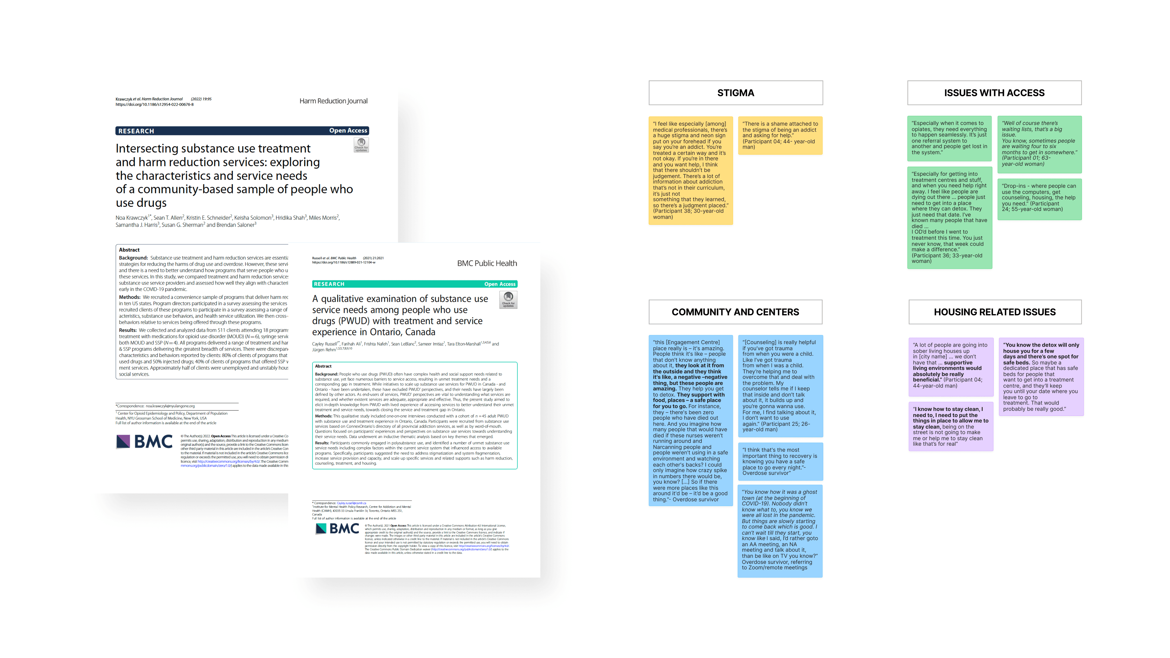
Lack of real time organized Data
There was no single platform with necessary information, forcing users to browse multiple websites to find locations or check availability.
Fear of Stigma
Users hesitated to get help due to the fear of being stigmatized or penalized. This fear of judgment acted as a significant barrier to seeking help.
Need for holistic support
Users needed something more than just HRS. They needed other support as food, employment and housing.
Problem Statement
How might we
better connect people who use drugs with local harm reduction service(HRS) centers
By providing reliable information
By supporting their agency
By protecting their privacy
By providing reliable information
By supporting their agency
By protecting their privacy
By providing reliable information
By supporting their agency
By protecting their privacy
By providing reliable information
By supporting their agency
By protecting their privacy
By providing reliable information
By supporting their agency
By protecting their privacy
with the end goal of improving
their quality of life as a whole?
03/ Wireframes & Feedback
Initial brainstorming
What are necessary features?
We brainstormed ideas to define main features and the structure of our final product.
competitive analysis & UX Inspiration
Analyzing benchmark points from existing apps
Because an app for drug use and harm reduction services is such a niche domain, there wasn't a direct competitor in the market. However, our client specifically wanted us to benchmark Yelp and other apps to help us build map and navigation features.

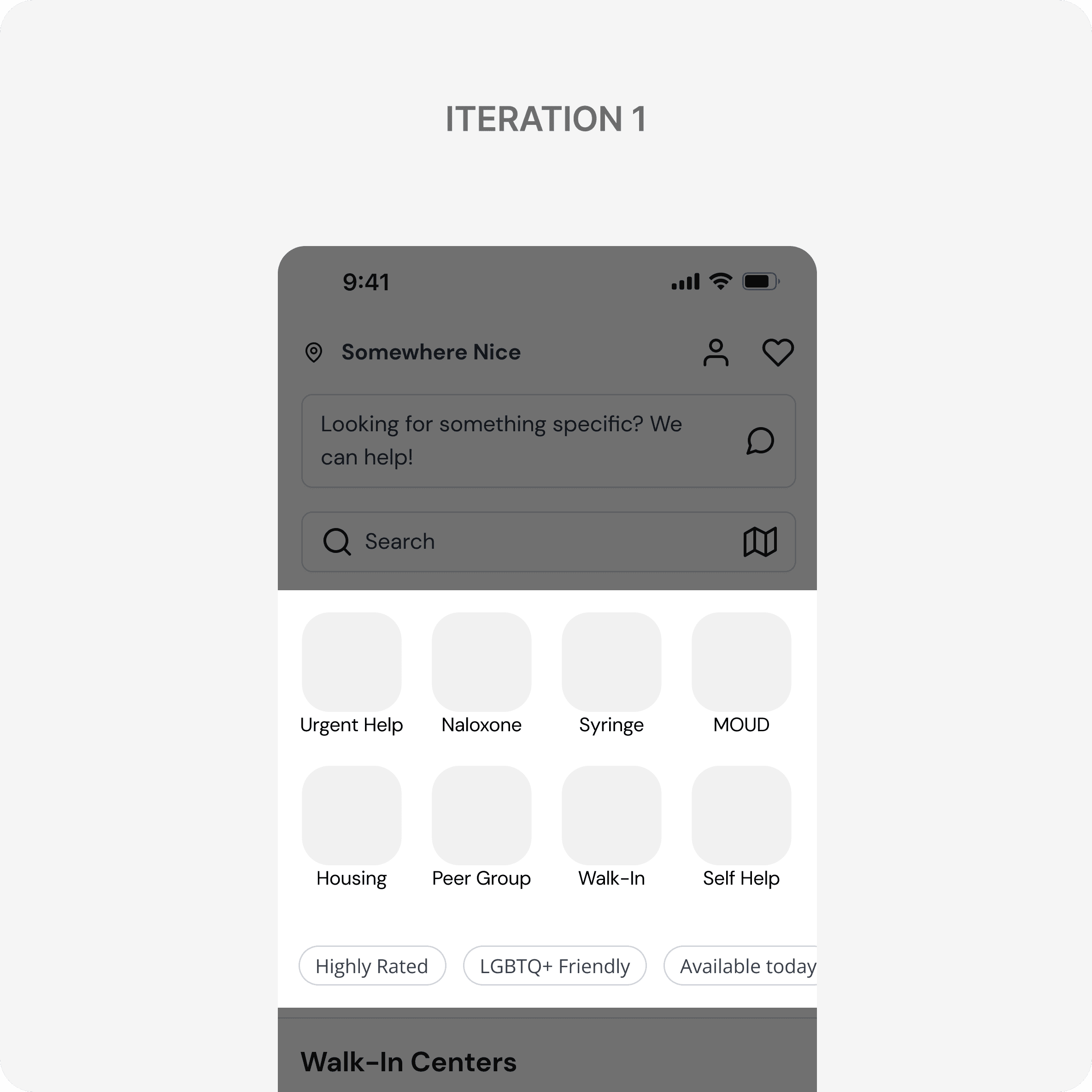
Wireframes
Lo-fi Wireframes
To align with our client, we prepared lo-fi wireframes based on the app structure. Here are the original slides we shared with our client, Dr. Joudrey. Colors were included to help our client visualize the final UI design.
Wireframes
Lo-fi Wireframes
To align with our client, we prepared lo-fi wireframes based on the app structure. Here are the original slides we shared with our client, Dr. Joudrey. Colors were included to help our client visualize the final UI design.
Wireframes
Lo-fi Wireframes
To align with our client, we prepared lo-fi wireframes based on the app structure. Here are the original slides we shared with our client, Dr. Joudrey. Colors were included to help our client visualize the final UI design.
Wireframes
Lo-fi Wireframes
To align with our client, we prepared lo-fi wireframes based on the app structure. Here are the original slides we shared with our client, Dr. Joudrey. Colors were included to help our client visualize the final UI design.
Wireframes
Lo-fi Wireframes
To align with our client, we prepared lo-fi wireframes based on the app structure. Here are the original slides we shared with our client, Dr. Joudrey. Colors were included to help our client visualize the final UI design.

Client feedback
Identifying gaps to address
During our first check-in, we received valuable feedback that helped us refine our direction to better align with their goals.
Client feedback
Identifying gaps to address
During our first check-in, we received valuable feedback that helped us refine our direction to better align with their goals.
Client feedback
Identifying gaps to address
During our first check-in, we received valuable feedback that helped us refine our direction to better align with their goals.
Client feedback
Identifying gaps to address
During our first check-in, we received valuable feedback that helped us refine our direction to better align with their goals.
Client feedback
Identifying gaps to address
During our first check-in, we received valuable feedback that helped us refine our direction to better align with their goals.
1
Love the map view, but streamline UX for accessibility
Our team was the only one to propose a map view, which our client appreciated. However, he raised a concern: 'Sometimes users may use this app under the influence or in emergencies. How can we make it easier to navigate?'
1
Love the map view, but streamline UX for accessibility
1
Love the map view, but streamline UX for accessibility
Our team was the only one to propose a map view, which our client appreciated. However, he raised a concern: 'Sometimes users may use this app under the influence or in emergencies. How can we make it easier to navigate?'
1
Love the map view, but streamline UX for accessibility
Our team was the only one to propose a map view, which our client appreciated. However, he raised a concern: 'Sometimes users may use this app under the influence or in emergencies. How can we make it easier to navigate?'
1
Love the map view, but streamline UX for accessibility
2
Re-evaluate the rating system
2
Re-evaluate the rating system
2
Re-evaluate the rating system
2
Re-evaluate the rating system
2
Re-evaluate the rating system
3
Is a chatbot feature the best option?
3
Is a chatbot feature the best option?
3
Is a chatbot feature the best option?
3
Is a chatbot feature the best option?
3
Is a chatbot feature the best option?
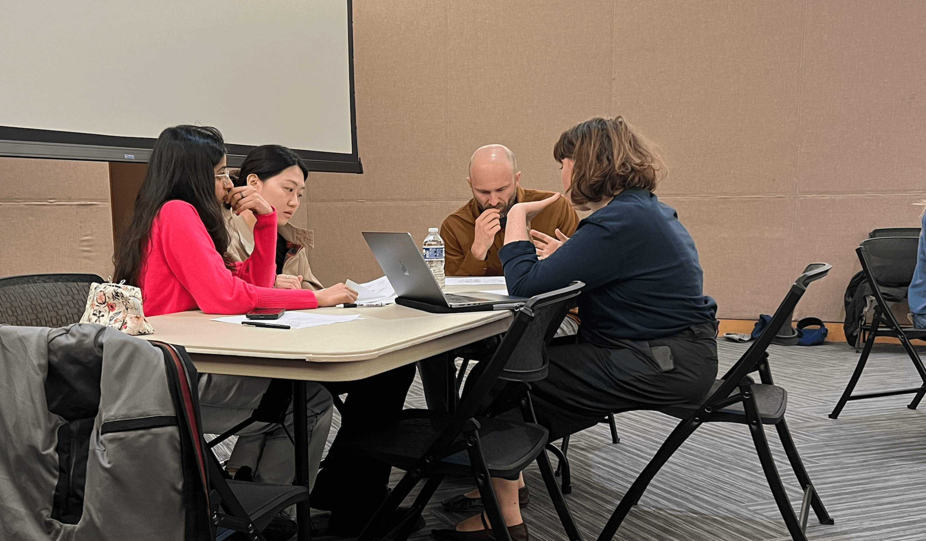
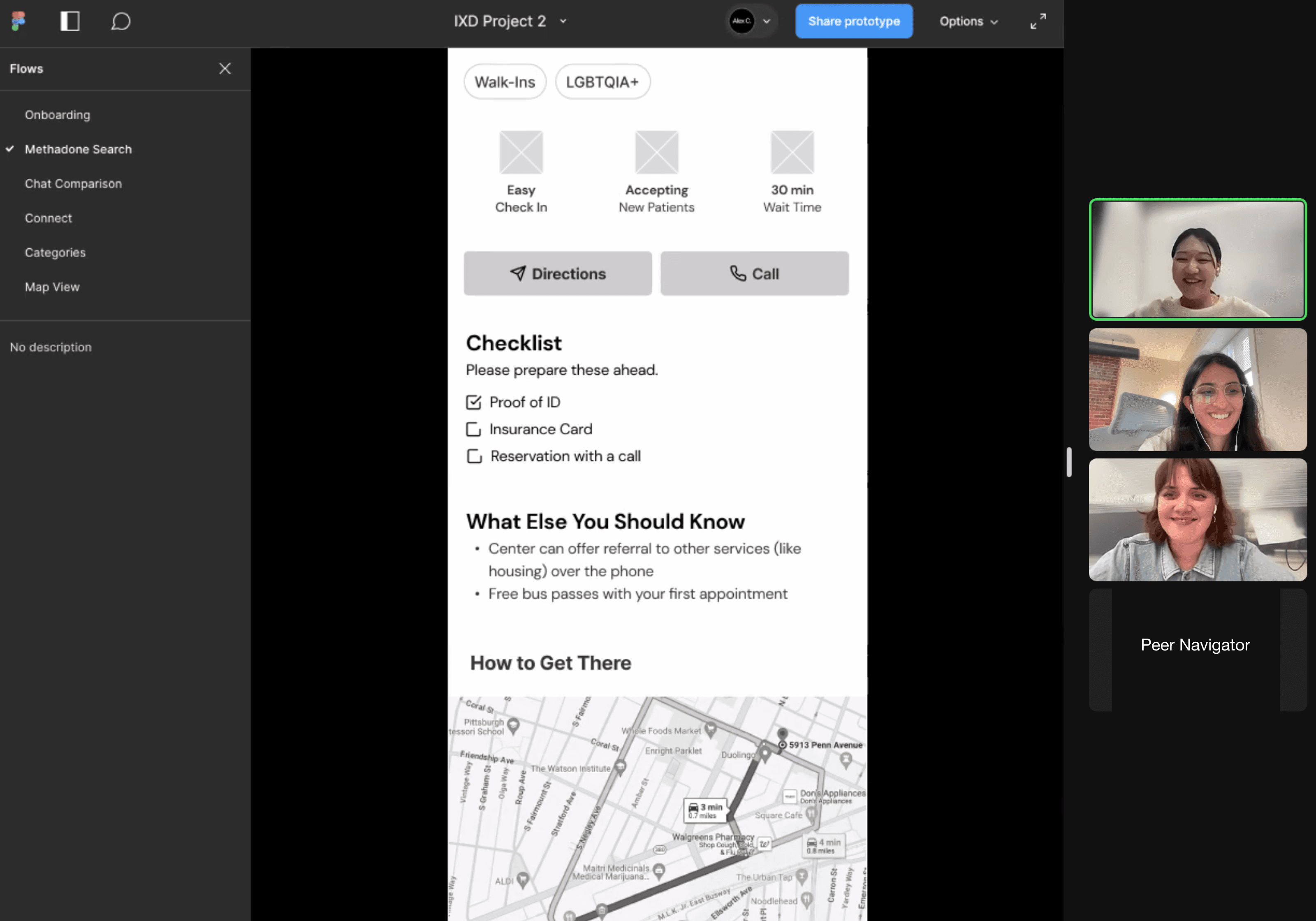
User testing
Learning from lived experiences
With our updated wireframe, we conducted 2 UI evaluations and user interviews with Peer Navigators to assess the overall UX and gain further insights.
User testing
Learning from lived experiences
With our updated wireframe, we conducted 2 UI evaluations and user interviews with Peer Navigators to assess the overall UX and gain further insights.
User testing
Learning from lived experiences
With our updated wireframe, we conducted 2 UI evaluations and user interviews with Peer Navigators to assess the overall UX and gain further insights.
User testing
Learning from lived experiences
With our updated wireframe, we conducted 2 UI evaluations and user interviews with Peer Navigators to assess the overall UX and gain further insights.
User testing
Learning from lived experiences
With our updated wireframe, we conducted 2 UI evaluations and user interviews with Peer Navigators to assess the overall UX and gain further insights.
04/ Design Iterations
04/ Challenges
& Iterations
04/ Challenges
& Iterations
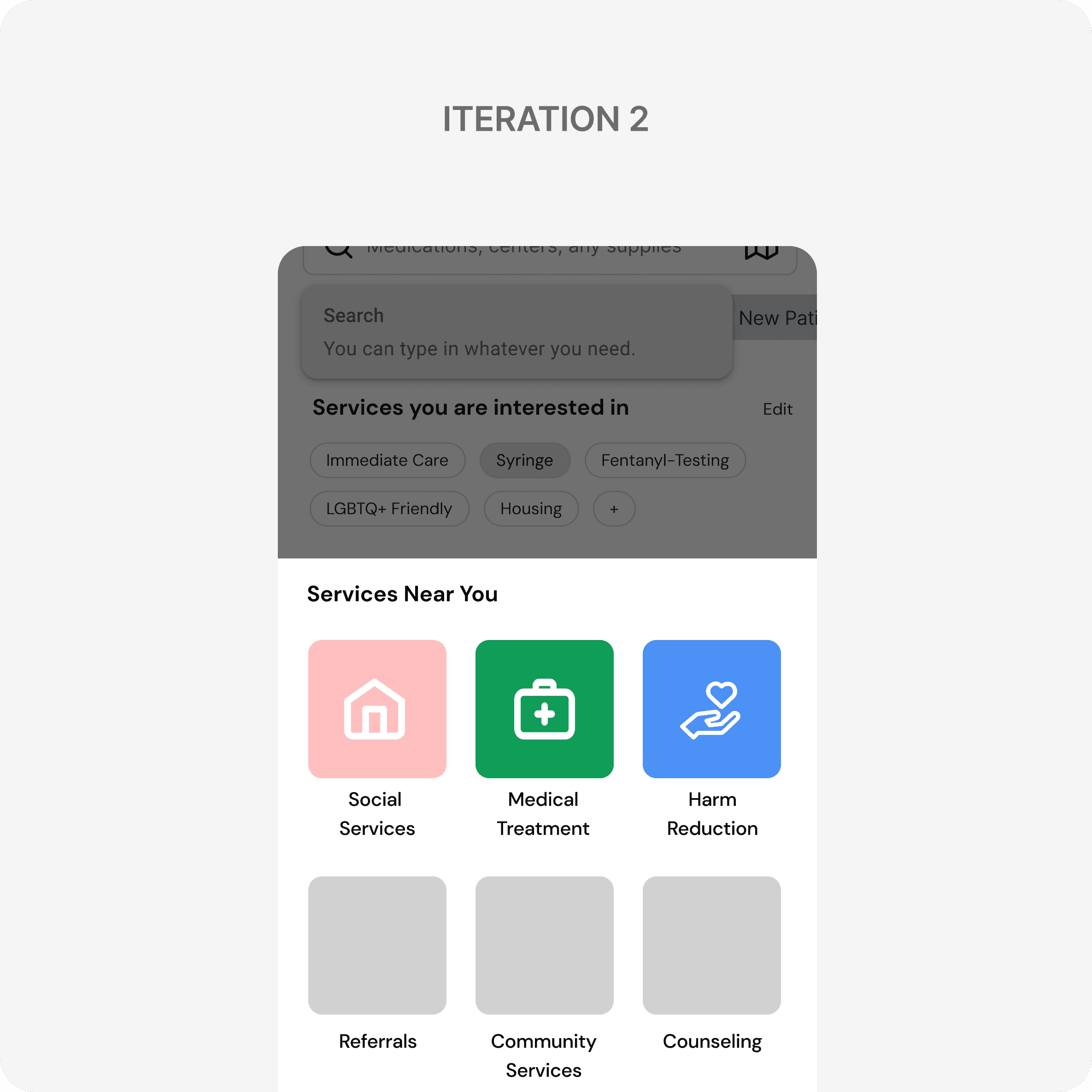
challenge 1
Categorizing is crucial, but that's not what users need
challenge 1
Categorizing is crucial, but that's not what users need
challenge 1
Categorizing is crucial but that's not what users need
challenge 1
Categorizing is crucial, but that's not what users need
challenge 1
Categorizing is crucial, but that's not what users need
Reduced the categorization to simplify the decision-making
Our team initially put a lot of effort in categorizing services and organizing them to help users navigate complex system more effectively.
However, user research revealed that this approach didn't align with users' actual decision-making processes. Users rely on their own mental models and the simple, everyday terms, not categories.
Why dropped
1
User confusion
We initially used eight categories, but through testing, we learned that the categories weren’t mutually exclusive and didn’t align with users' mental models.
2
Ineffective UI
Using 6 to 8 different colors for coding was visually overwhelming.
Why dropped
1
User confusion
We initially used eight categories, but through testing, we learned that the categories weren’t mutually exclusive and didn’t align with users' mental models.
2
Ineffective UI
Using 6 to 8 different colors for coding was visually overwhelming.
Why dropped
1
User confusion
We initially used eight categories, but through testing, we learned that the categories weren’t mutually exclusive and didn’t align with users' mental models.
2
Ineffective UI
Using 6 to 8 different colors for coding was visually overwhelming.
Why dropped
1
User confusion
We initially used eight categories, but through testing, we learned that the categories weren’t mutually exclusive and didn’t align with users' mental models.
2
Ineffective UI
Using 6 to 8 different colors for coding was visually overwhelming.
Why dropped
1
User confusion
We initially used eight categories, but through testing, we learned that the categories weren’t mutually exclusive and didn’t align with users' mental models.
2
Ineffective UI
Using 6 to 8 different colors for coding was visually overwhelming.
Why selected
Simpler categorization
1
Simpler and general 4 categories matched user's mental model and supported easy navigation.
Intuitive color-coding
2
Color-coded system to support more intuitive navigation.
Content Hierarchy
3
Filter chips were used to give users hints about what each category includes and were arranged in order of highest relevance.
challenge 2
Promoting community spirit and increasing reliability
challenge 2
Promoting community spirit and increasing reliability
challenge 2
Promoting community spirit and increasing reliability
challenge 2
Promoting community spirit and increasing reliability
challenge 2
Promoting community spirit and increasing reliability
Simplified feedback system to nudge users to share their voices
Streamlined content based on the priority.
Pre-filled chips enable users to add their opinion anonymously, without the need to provide personal information.
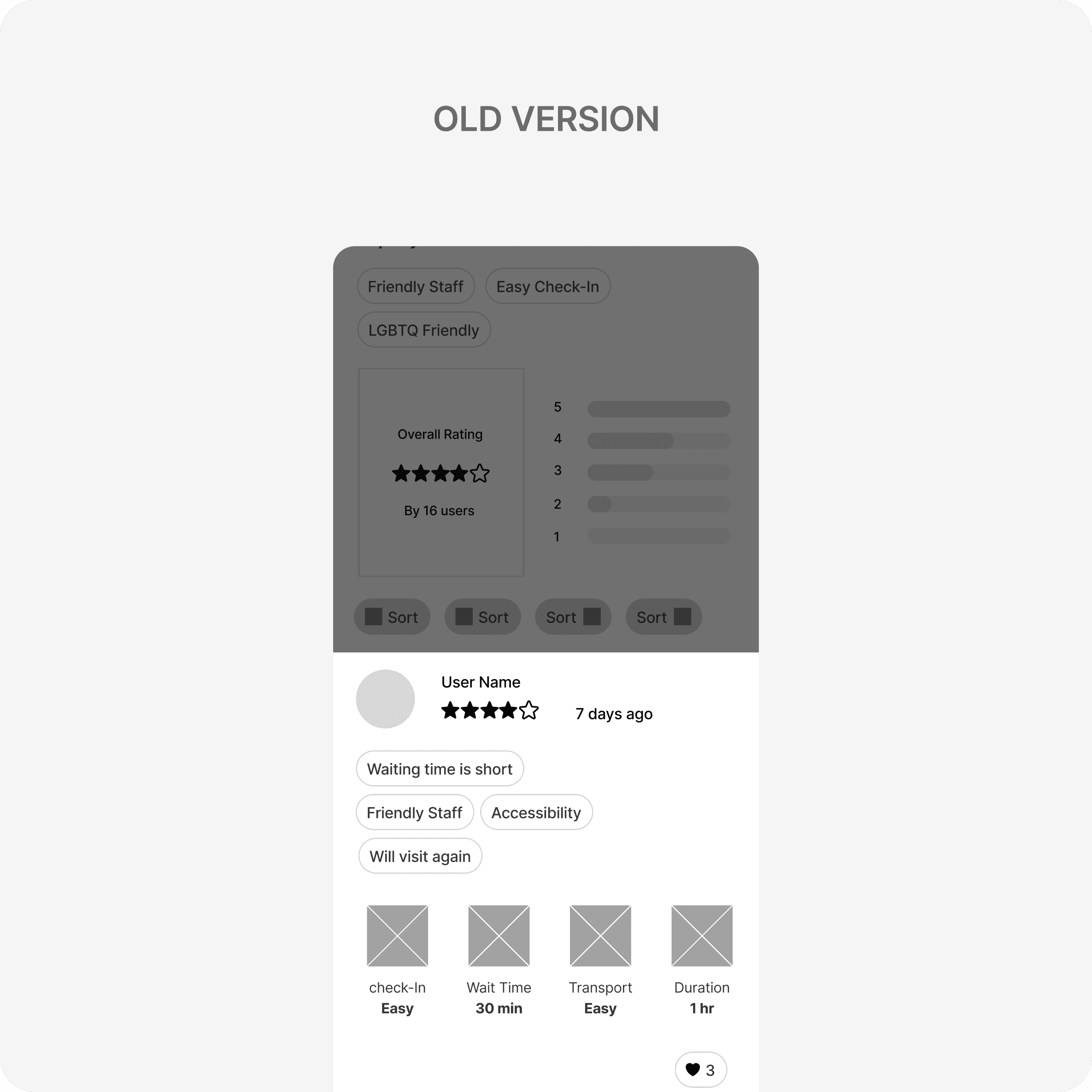
Before
1
Lack of value
The star rating posed the risk of misuse and didn’t add value to the community.
1
Lack of value
The star rating posed the risk of misuse and didn’t add value to the community.
1
Lack of value
The star rating posed the risk of misuse and didn’t add value to the community.
1
Lack of value
The star rating posed the risk of misuse and didn’t add value to the community.
1
Lack of value
The star rating posed the risk of misuse and didn’t add value to the community.
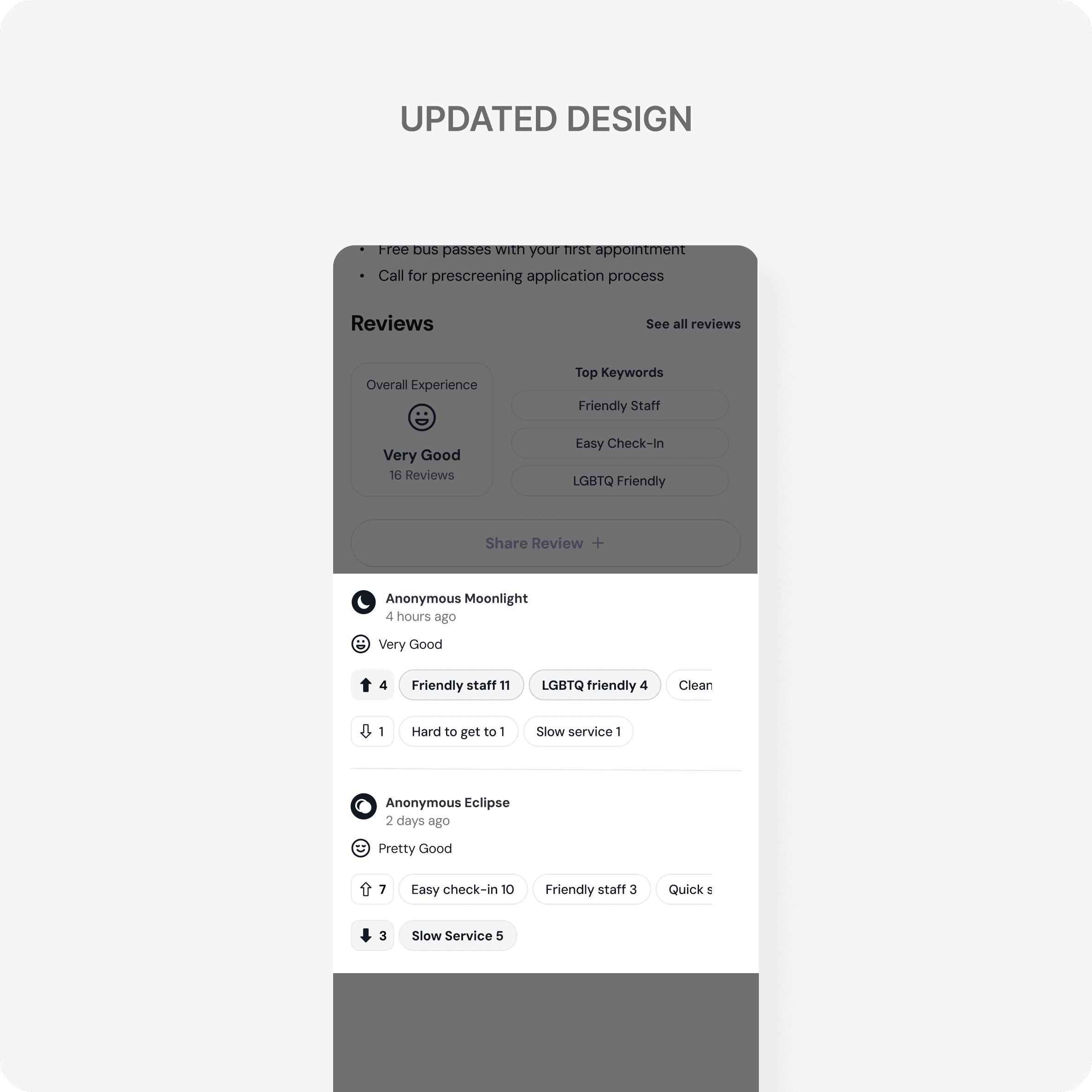
After
Increasing credibility
1
Each user can increase the reliability of a single user's review by reacting to it.
Increasing credibility
1
Each user can increase the reliability of a single user's review by reacting to it.
Increasing credibility
1
Each user can increase the reliability of a single user's review by reacting to it.
Increasing credibility
1
Each user can increase the reliability of a single user's review by reacting to it.
Increasing credibility
1
Each user can increase the reliability of a single user's review by reacting to it.
Feasibility
2
Reduced unnecessary visual elements.
Feasibility
2
Reduced unnecessary visual elements.
Feasibility
2
Reduced unnecessary visual elements.
Feasibility
2
Reduced unnecessary visual elements.
Feasibility
2
Reduced unnecessary visual elements.
challenge 3
Setting the right tone for a safer space
challenge 3
Setting the right tone for a safer space
challenge 3
UX writing to optimize user experience
challenge 3
Setting the right tone for a safer space
challenge 3
Setting the right tone for a safer space
Combined UI and UX writing to enhance trustworthiness
Through user tests, we learned that the chat feature is more than just a messaging tool; it's where users assess the app's trustworthiness and where peer navigators build connections.
To foster the right tone, we iterated and refined the UX writing to create a safer space for both peer navigators and users seeking services.
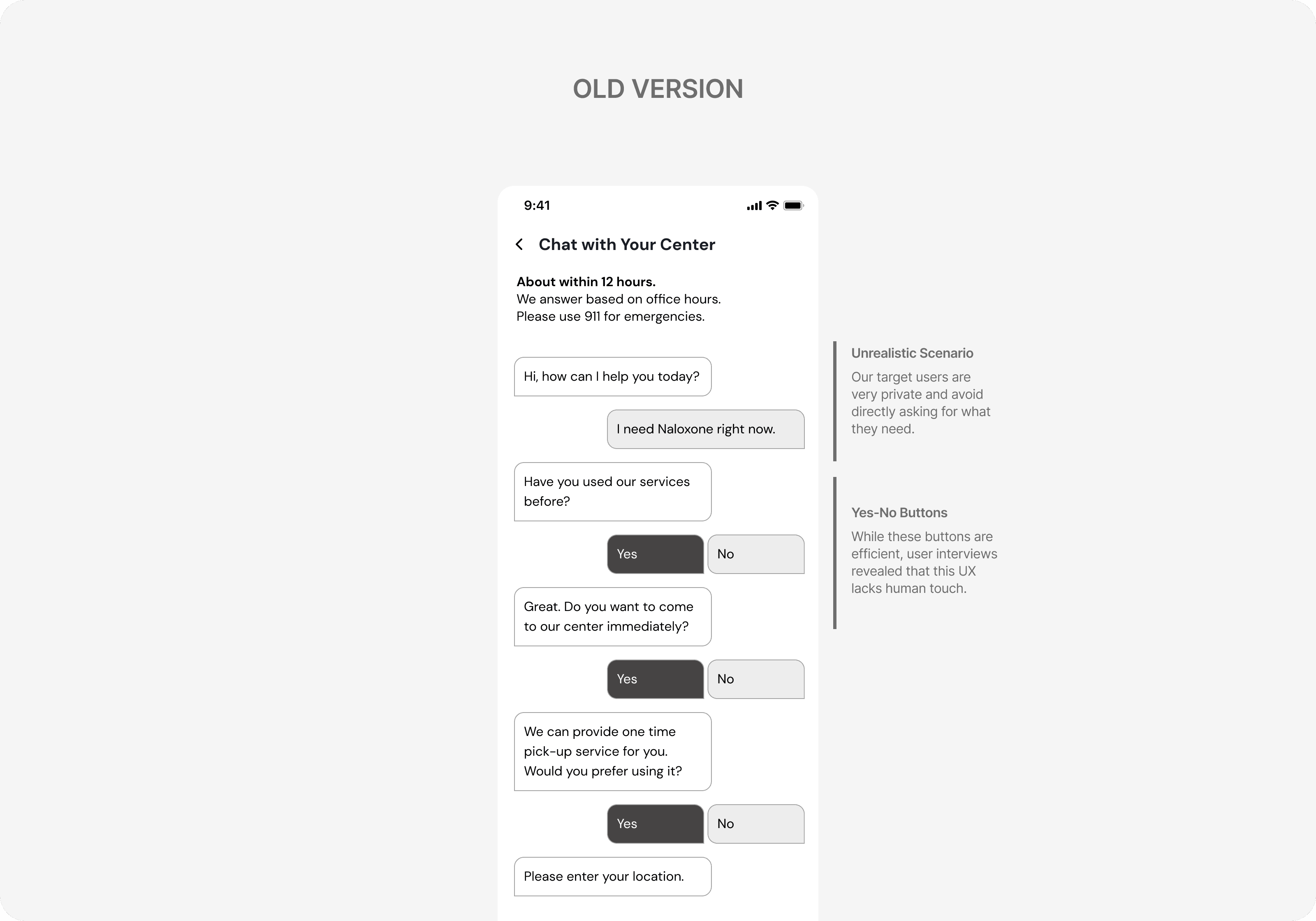
1
Feasibility
Our original idea was to connect users with the center. However this idea was unrealistic and required additional staffing.
1
Feasibility
Our original idea was to connect users with the center. However this idea was unrealistic and required additional staffing.
1
Feasibility
Our original idea was to connect users with the center. However this idea was unrealistic and required additional staffing.
1
Feasibility
Our original idea was to connect users with the center. However this idea was unrealistic and required additional staffing.
1
Feasibility
Our original idea was to connect users with the center. However this idea was unrealistic and required additional staffing.
2
Too robotic
While buttons made the process simple and easy, user tests showed that they lacked a human touch, making users more reluctant to share their personal information.
2
Too robotic
While buttons made the process simple and easy, user tests showed that they lacked a human touch, making users more reluctant to share their personal information.
2
Too robotic
While buttons made the process simple and easy, user tests showed that they lacked a human touch, making users more reluctant to share their personal information.
2
Too robotic
While buttons made the process simple and easy, user tests showed that they lacked a human touch, making users more reluctant to share their personal information.
2
Too robotic
While buttons made the process simple and easy, user tests showed that they lacked a human touch, making users more reluctant to share their personal information.
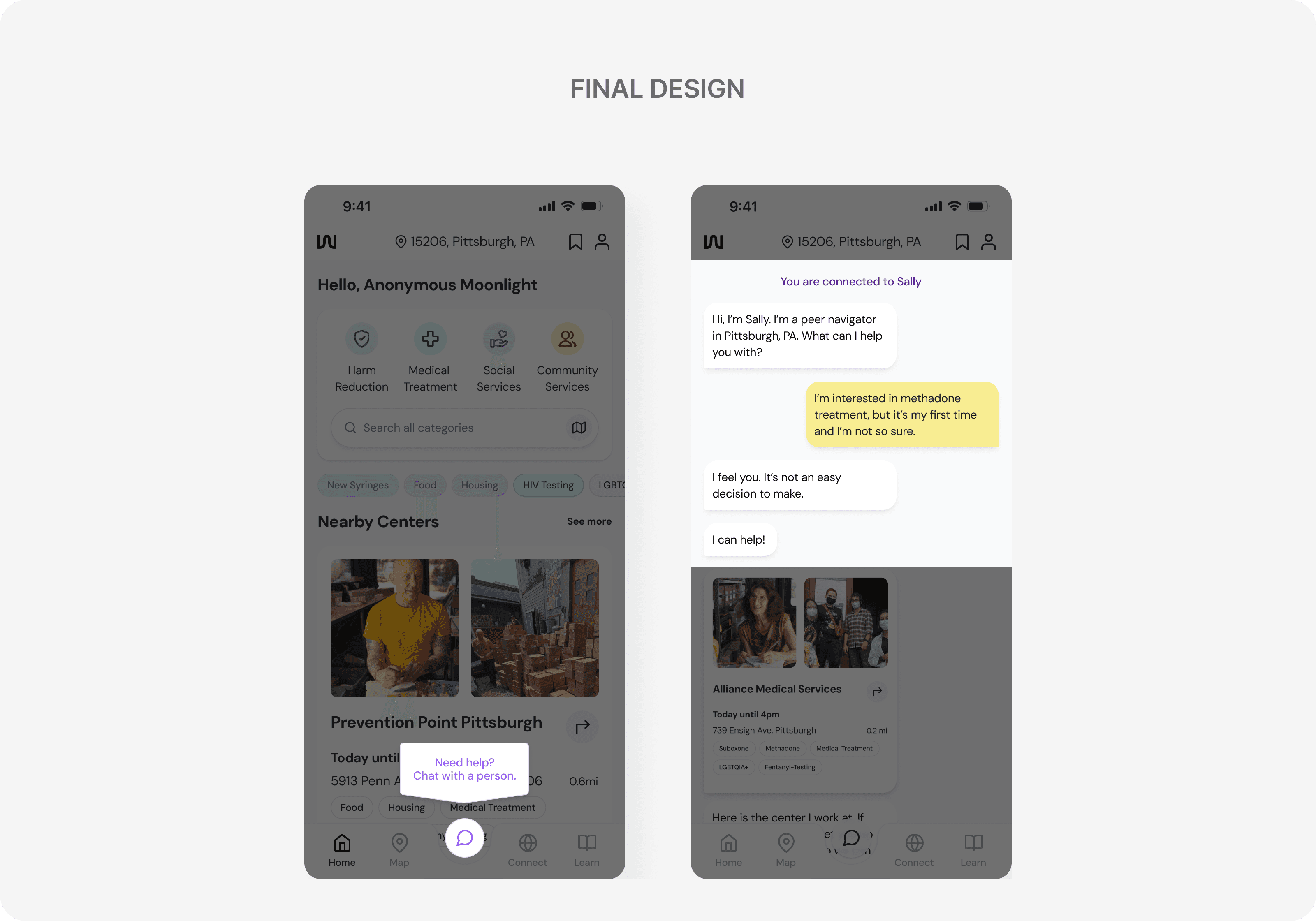
Nudge
1
Added a tooltip that automatically appears when users are inactive on the home screen to inform them about the chat feature.
Nudge
1
Added a tooltip that automatically appears when users are inactive on the home screen to inform them about the chat feature.
Nudge
1
Added a tooltip that automatically appears when users are inactive on the home screen to inform them about the chat feature.
Nudge
1
Added a tooltip that automatically appears when users are inactive on the home screen to inform them about the chat feature.
Nudge
1
Added a tooltip that automatically appears when users are inactive on the home screen to inform them about the chat feature.
Increasing Trust
2
Adjusted the UX writing to clearly identify the person users are speaking with, creating a more human touch and fostering trust.
Increasing Trust
2
Adjusted the UX writing to clearly identify the person users are speaking with, creating a more human touch and fostering trust.
Increasing Trust
2
Adjusted the UX writing to clearly identify the person users are speaking with, creating a more human touch and fostering trust.
Increasing Trust
2
Adjusted the UX writing to clearly identify the person users are speaking with, creating a more human touch and fostering trust.
Increasing Trust
2
Adjusted the UX writing to clearly identify the person users are speaking with, creating a more human touch and fostering trust.
challenge 4
Forget personas, focus on the individual.
challenge 4
Forget personas, focus on the individual.
challenge 4
UX writing to optimize user experience
challenge 4
Forget personas, focus on the individual.
challenge 4
Forget personas, focus on the individual.
Focused on potential user behaviors rather than creating a stereotypical persona
One of the biggest challenges of this project was the lack of common understanding of users' experiences.
However, through research, we realized that creating a single narrative wasn't helpful. Instead, we took a unique approach by not relying on a 'persona,' and used broader behavioral segmentation to develop user flows.
05/ Branding
DESIgn Manifesto
Different needs,
Diverse stories,
Let them discover
Different needs,
Diverse stories,
Let them discover
Different needs,
Diverse stories,
Let them discover
LOGO & Slogan
We Live, We Weave
LOGO ANIMATION
06/ Takeaways
1
Real voices into useful features
This project was research-driven. By involving users with lived experiences, we were able to incorporate more realistic features that we wouldn’t have considered otherwise.
1
Real voices into useful features
1
Real voices into useful features
This project was research-driven. By involving users with lived experiences, we were able to incorporate more realistic features that we wouldn’t have considered otherwise.
1
Real voices into useful features
This project was research-driven. By involving users with lived experiences, we were able to incorporate more realistic features that we wouldn’t have considered otherwise.
1
Real voices into useful features
2
UX as a holistic experience
2
UX as a holistic experience
2
UX as a holistic experience
2
UX as a holistic experience
2
UX as a holistic experience
3
Building something new using familiar patterns
3
Building something new using familiar patterns
3
Building something new using familiar patterns
3
Building something new using familiar patterns
3
Building something new using familiar patterns